Reading the heatmap: gamma over time
Use the Net and Abs heatmaps to spot durable levels, concentrating liquidity zones, and the color-flip pattern that warns of volatility before the candles do — and know when to leave the heatmap and switch to the snapshot's weekly view (e.g. Friday pinning).
The lessons so far have shown you what a single GEX snapshot looks like — walls, the Flip point, confluence stars. But that's a photograph. The market is a movie.
The heatmap turns the snapshot into a film. It plots GEX on a 2D grid: time on the X-axis, strike price on the Y-axis. Each cell is colored by how much gamma sits at that strike at that moment.
This lesson covers how to read it — and what it tells you that a regular GEX chart can't.
Two heatmaps, two purposes
GammaFlip ships two heatmap modes. They look similar but answer different questions, and they map directly onto markers you've already learned.
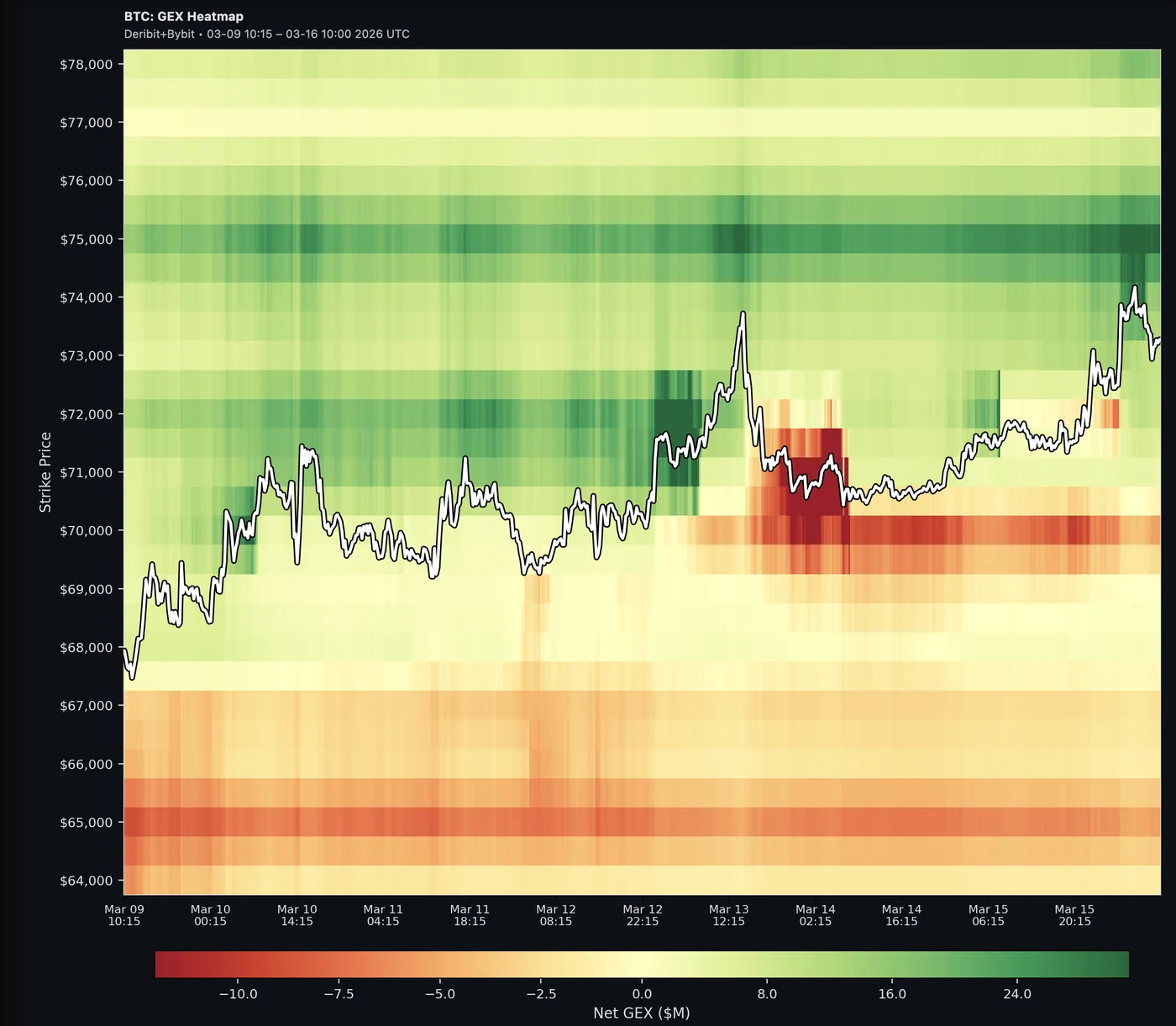
Net GEX heatmap — signed gamma across every strike
The Net heatmap shows signed gamma at every strike-and-time cell — the full landscape, not just the walls. P/N markers (Lessons 3-4) are the brightest peaks within this picture, but you also see all the smaller stabilizing and amplifying zones around them.
- Green = positive gamma (stabilizing zones; the brightest greens are P1/P2)
- Red = negative gamma (volatility zones; the brightest reds are N1/N2)
- Brightness = magnitude — the brighter the cell, the stronger the force at that strike
A bright green band that's been holding for days is a durable wall (and likely the current P1). A bright red band is a durable negative wall (likely N1). But the value of the heatmap is also seeing the gradient between them — where stabilizing strength fades, where weak walls sit, where the regime tilts.
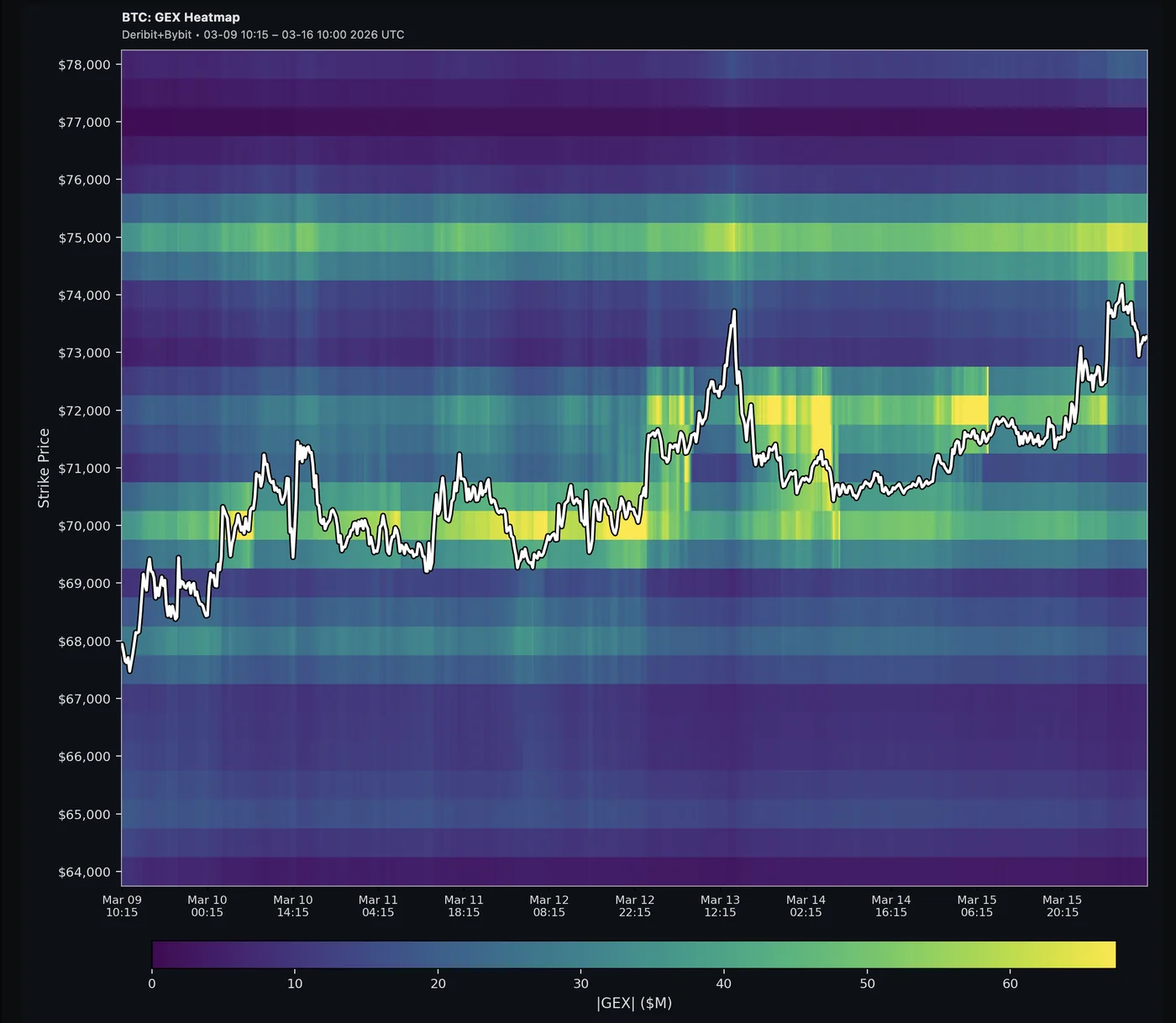
Absolute GEX heatmap — unsigned magnitude across every strike
The Abs heatmap shows unsigned total gamma at every strike-and-time cell. The brightest rows mark the strikes with the highest options activity overall; dimmer rows show how that activity spreads across adjacent strikes.
- Single color, intensity scaled — brighter = more total gamma at that strike
- No green/red distinction — the Abs view doesn't care about sign, only concentration
A bright row is where total options activity concentrates — a high-liquidity zone where you should expect more hedging flow and noisier price action whenever spot visits.
When to use which
| Question | Use |
|---|---|
| Where are durable P/N walls? | Net heatmap |
| Is a wall starting to crack? (red appearing inside green) | Net heatmap |
| Where are durable high-liquidity / high-volume zones? | Absolute heatmap |
| Is total options activity concentrating somewhere new? | Absolute heatmap |
| Where will Friday's pin land? | Snapshot chart, weekly expiration selected (the heatmap aggregates all expirations) |
Three patterns to look for
The heatmap is most powerful when you stop reading it as a chart and start reading it as patterns. Three are worth knowing by sight.
Pattern 1: Horizontal bands — durable levels (Net heatmap)
A horizontal band that's stayed bright for multiple days is a durable level. Strikes that flicker in and out come and go with daily flow. Strikes that hold their color across days are doing structural work.
Practical use: durable levels carry more weight than fresh ones. If P1 just popped up today, treat it tactically. If P1 has been the same strike for 5 days running, treat it as a major structural zone. Same logic applies for N1.
Pattern 2: Brightening trends — liquidity concentrating (Absolute heatmap)
A row in the Abs heatmap that gets visibly brighter over multiple days is options activity concentrating at that strike. Across all expirations combined, the market is building up contracts there — which translates to more hedging flow, tighter spreads, and noisier two-way action whenever price visits.
Practical use: flag emerging high-liquidity zones early, before they show up as durable A1/A2 candidates on the weekly snapshot. A brightening row tells you where flow and noise will concentrate when spot gets near. For the Friday pin specifically, you still need the snapshot chart at the weekly expiration — the heatmap aggregates every expiration, so it can't isolate the upcoming weekly magnet.
Pattern 3: Color flip — green band turns red (Net heatmap)
The most actionable pattern, and the hardest to spot from a snapshot. Watch a green band over several hours. If a red streak appears inside it, the wall is starting to crack — dealers at that strike are flipping from stabilizing to amplifying.
Within 24-48 hours, the green band can fully invert into a red zone. The level that was acting as resistance (or support) becomes a volatility zone where moves accelerate past it.
Practical use: this is the heatmap's earliest warning. The snapshot still shows the wall today, but the heatmap shows the structural break first. Reduce conviction on that level immediately. If the red streak grows, switch from a fade frame to a momentum frame for trades that cross it.
The mantra:
Resistance forms in GEX before it forms in price. Reversal flips in GEX before they show in candles.
A worked example — April 2026 BTC
A real case from April 13-20, 2026 shows all three patterns operating at once.
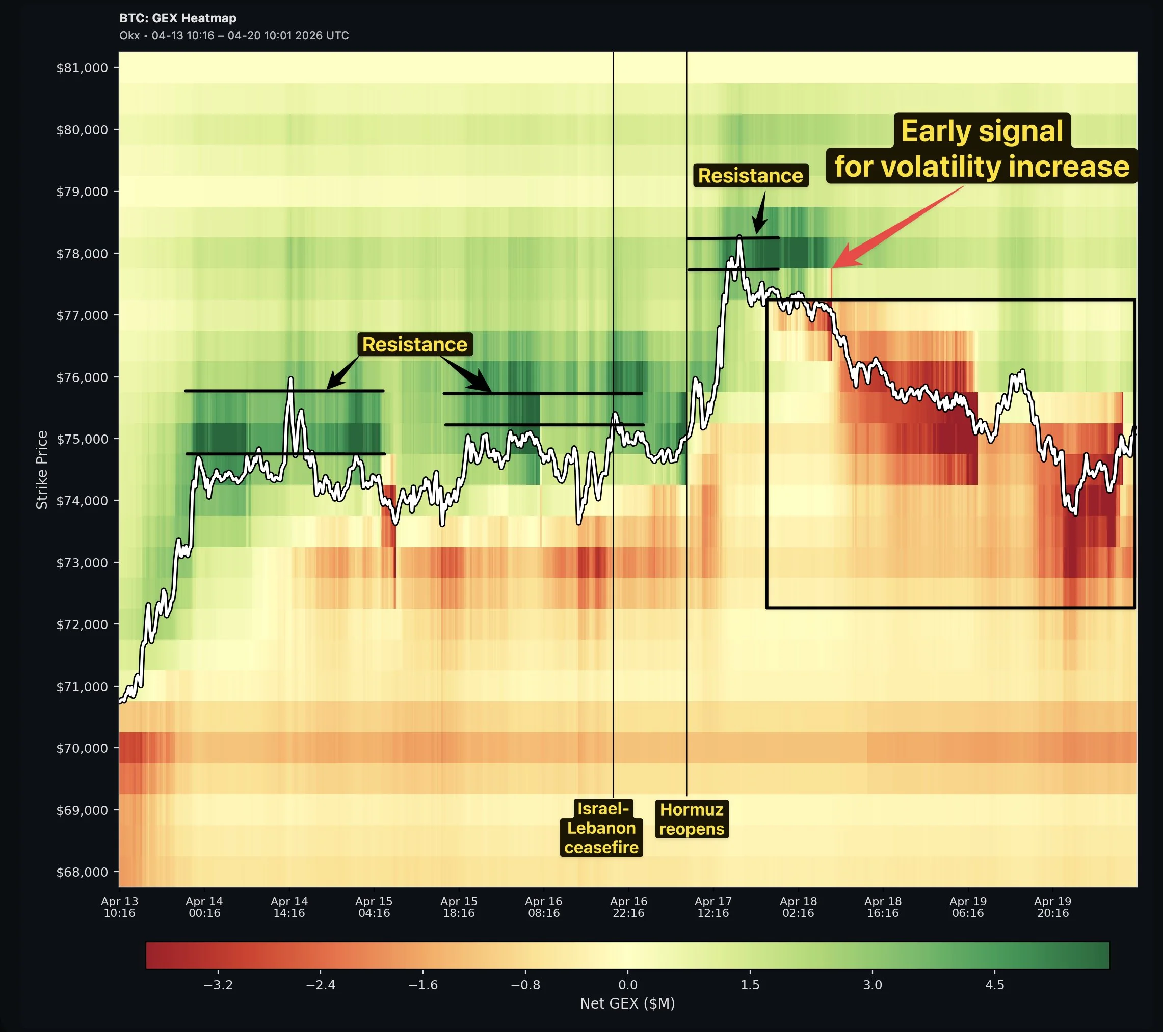
Apr 13-16 — Pattern 1 in action. A bright green band sat at $75-76K for three days. BTC traded up to it, tested, rejected, retraced, tested again — the wall was visible on the heatmap before price ever touched it. Dealers had pre-positioned hedges; the heatmap showed the ceiling days before the candles confirmed it.
Apr 16-17 — repositioning after a catalyst. The Israel-Lebanon ceasefire (Apr 16, 21:00 UTC) and Hormuz reopening (Apr 17) sent BTC ripping from $75K to $78.2K. The heatmap rebuilt almost instantly: a new green wall formed at $77-78K. Price hit it and stalled at the exact level. Same mechanic, new ceiling — still predictable.
Apr 17-19 — Pattern 3 in action: the color flip. At the exact peak on Apr 17, a red streak punched through the green wall at $77K. Within 48 hours, that streak grew into a full red volatility zone from $72K to $77K. The level that was resistance 24 hours earlier became the upper boundary of a momentum zone — and price followed.
If you only watched the snapshot, the green wall at $77K still looked intact when the red streak first appeared. The heatmap showed the structural break early — the snapshot lagged by roughly a day.
The trade. Watching the heatmap, you'd have:
- Used $75-76K as a take-profit zone in the Apr 13-16 range
- Repositioned shorts at $77-78K after the catalyst push
- Caught the volatility flip when the red streak first appeared on Apr 17
- Stopped fading the level once the red zone consolidated, switched to momentum frame
Three decisions, one chart. None of them visible on the snapshot in real time.
When the heatmap beats the snapshot
Snapshot view is fine for "where are levels right now?" The heatmap is better when you want to know:
- Is this level new or old? A wall that just appeared today is less reliable than one that's been there a week.
- Is liquidity concentrating somewhere? Snapshot doesn't show trajectory — the heatmap does.
- Is the wall starting to crack? A red streak inside a green band is invisible on the snapshot until it's too late.
The heatmap is especially valuable for spotting structural shifts days before they crystallize on the snapshot — durable bands hardening, walls cracking, activity migrating between strikes. For the Friday pin specifically, the heatmap can't help (it's TOTAL-only); use the snapshot chart's weekly expiration for that.
What to ignore on the heatmap
A few traps:
- Wisps and sparkles. Tiny isolated bright spots are usually flow noise — a single block trade, an exchange-specific quirk. Look for sustained bands, not point lights.
- Settlement-day discontinuities. After Friday 08:00 UTC, the heatmap shows a vertical "cut" where the chart rebuilds. Don't try to read patterns across the cut — they're discontinuous (Lesson 9 covers this in detail).
- Color intensity != action level. A bright band at $200K above current price doesn't matter — distance from price still applies. Read the heatmap zoomed close to current price for actionable insights.
A simple heatmap routine
For traders who already have a snapshot routine (Flip / P1 / P2 / N1), add one heatmap glance per session:
- Open the heatmap (the History tab)
- Start with Net for the structural read
- Look at the past 3-5 days near current price
- Note any horizontal bands that have held color for multiple days — those are your durable P/N levels
- Scan for color flips — red streaks inside green bands or vice versa. Those are early warnings; reduce conviction on the affected level
- Switch to Abs to flag durable high-liquidity zones — strikes where total options activity has concentrated over multiple days. (For the Friday pin itself, use the snapshot chart's weekly expiration; the heatmap aggregates all expirations and can't isolate it.)
A minute or two. Adds a temporal layer to the static read you already do — and surfaces structural breaks that the snapshot won't show until they're already underway.
Quick mnemonic
The snapshot tells you where. The heatmap tells you whether it's been there long enough to trust.
Most traders never look at the heatmap because the snapshot answers their immediate question. The ones who do — and who learn to read horizontal bands as durability and brightening as pinning — get a structural edge that single-frame readers miss.
Next lesson: how to fold all of this — markers, confluence, heatmap — into your existing TA workflow.
Check your understanding
On the heatmap, you see a horizontal green band sitting at $96,000 that's been bright for the past 5 days. What does that tell you?
$96,000 is a durable wall — positive gamma has stayed concentrated there across multiple days, surviving daily flow shifts. That's a much stronger structural level than a P1 that only appeared today. Treat it as a high-conviction take-profit / mean-reversion zone.
It's Wednesday. The Abs heatmap shows a row at $98,000 getting visibly brighter each day. What does it tell you — and what does it *not* tell you?
Total options activity across all expirations is concentrating at $98K. Expect more hedging flow, tighter liquidity, and noisier price action whenever spot visits that level. What it does NOT tell you is where Friday's pin will land — the heatmap aggregates every expiration and can't isolate the upcoming weekly. To check the Friday magnet, switch to the snapshot chart and select the weekly expiration; A1 there is what the market will actually pin to.
You've been watching a green wall at $77K for two days. This morning a small red streak appears inside it. What does that mean and what do you do?
Earliest possible signal that the wall is cracking — dealers at that strike are starting to flip from stabilizing to amplifying. Reduce conviction on $77K as resistance immediately. If the streak grows over the next 24-48 hours, expect the level to fully invert into a volatility zone with momentum continuation past it. Don't stand in front of it for a fade.