Latest updates, features, and improvements to GammaFlip.io
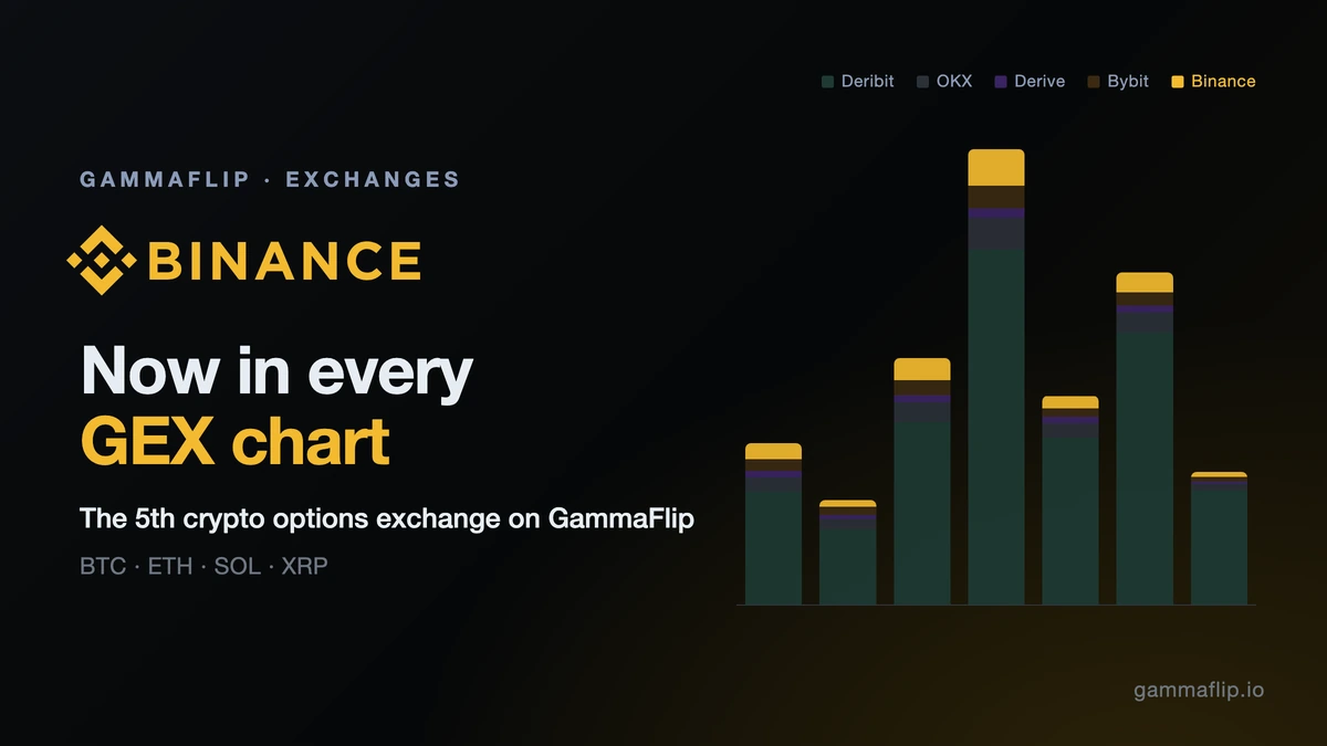
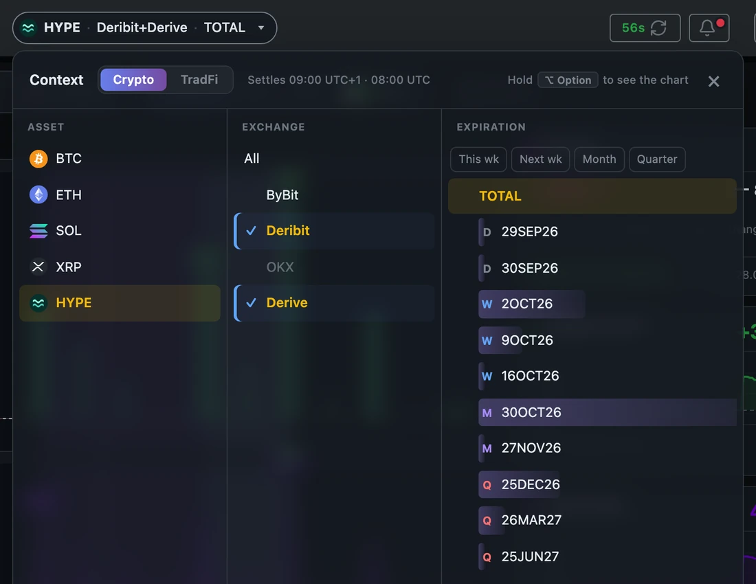
binance works on every /api/v1 endpoint, alone or in a mix (deribit+binance), and through the MCP connector. all and combined now mean five exchanges. If your requests spell out the old four (deribit+bybit+okx+derive), that is now a mix without Binance; use all instead.https://mcp.gammaflip.io/mcp as a connector in Claude or ChatGPT, sign in with your GammaFlip account, and the assistant can read our data for you: current levels (flip, regime, walls) with a comparison to 1, 7 or 30 days back, GEX by strike, term structure, levels over time and the full picture at a past moment. It covers BTC, ETH, SOL, XRP and HYPE across Deribit, Bybit, OKX and Derive, plus 17 US stocks, ETFs and indices, with history from 1 May 2026. No API key is needed. Access follows your plan: any plan or trial that includes API access works, for the markets in that plan, and requests share the API's daily limit (50 on trial, 500 on paid plans). The assistant can only read data: no charts, alerts or file downloads yet. Setup, step by step: Connect GammaFlip to Claude and ChatGPT.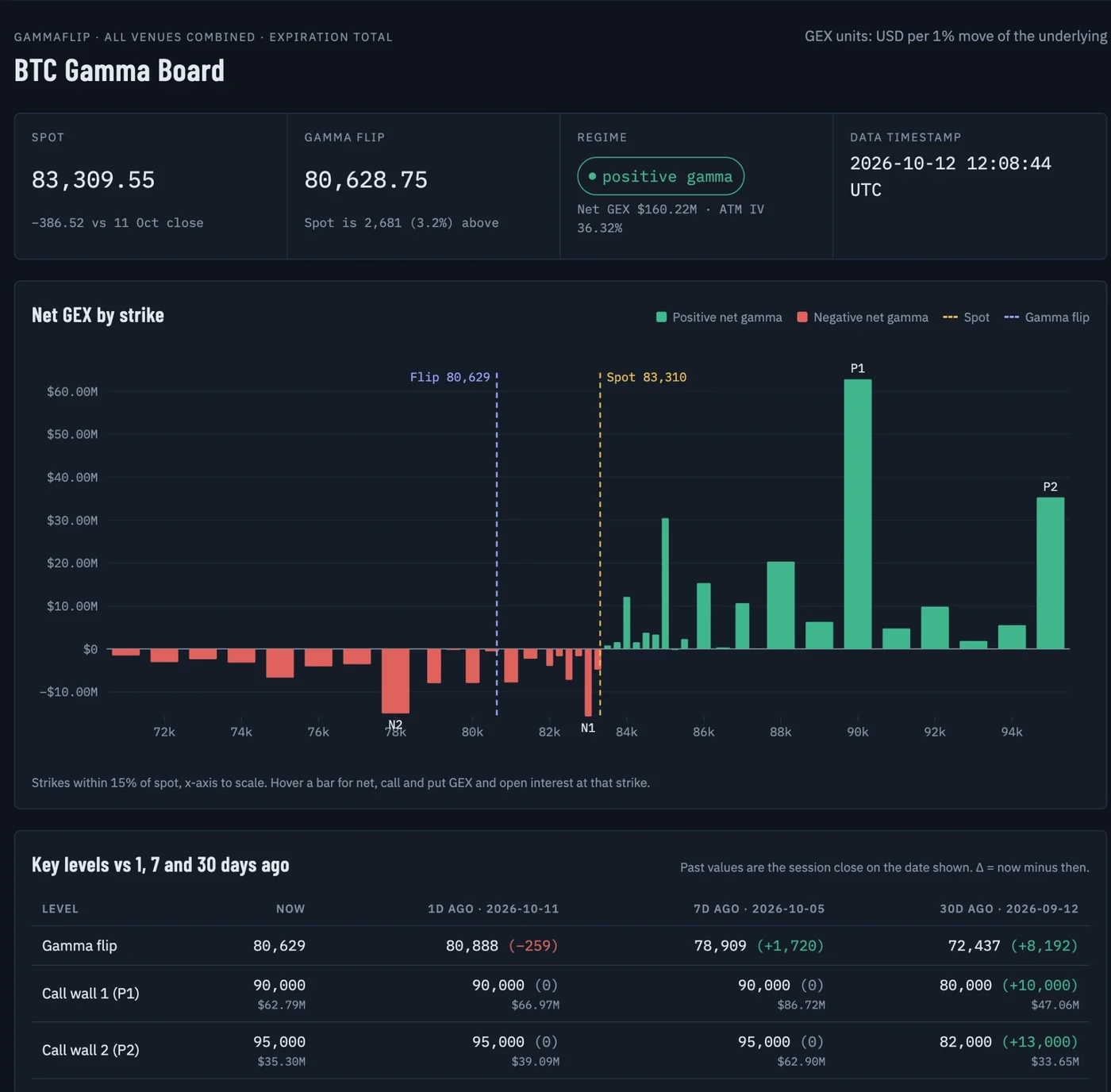
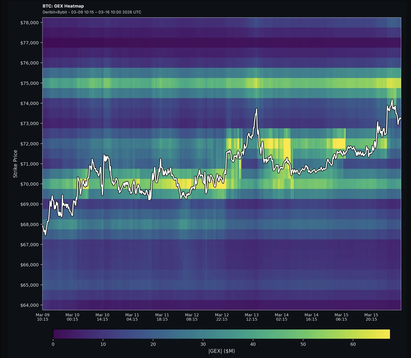
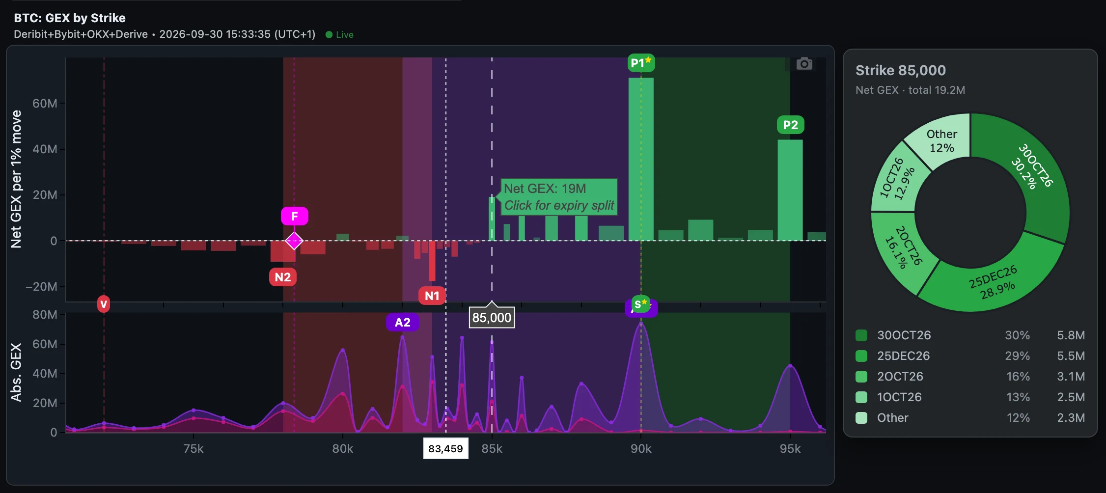
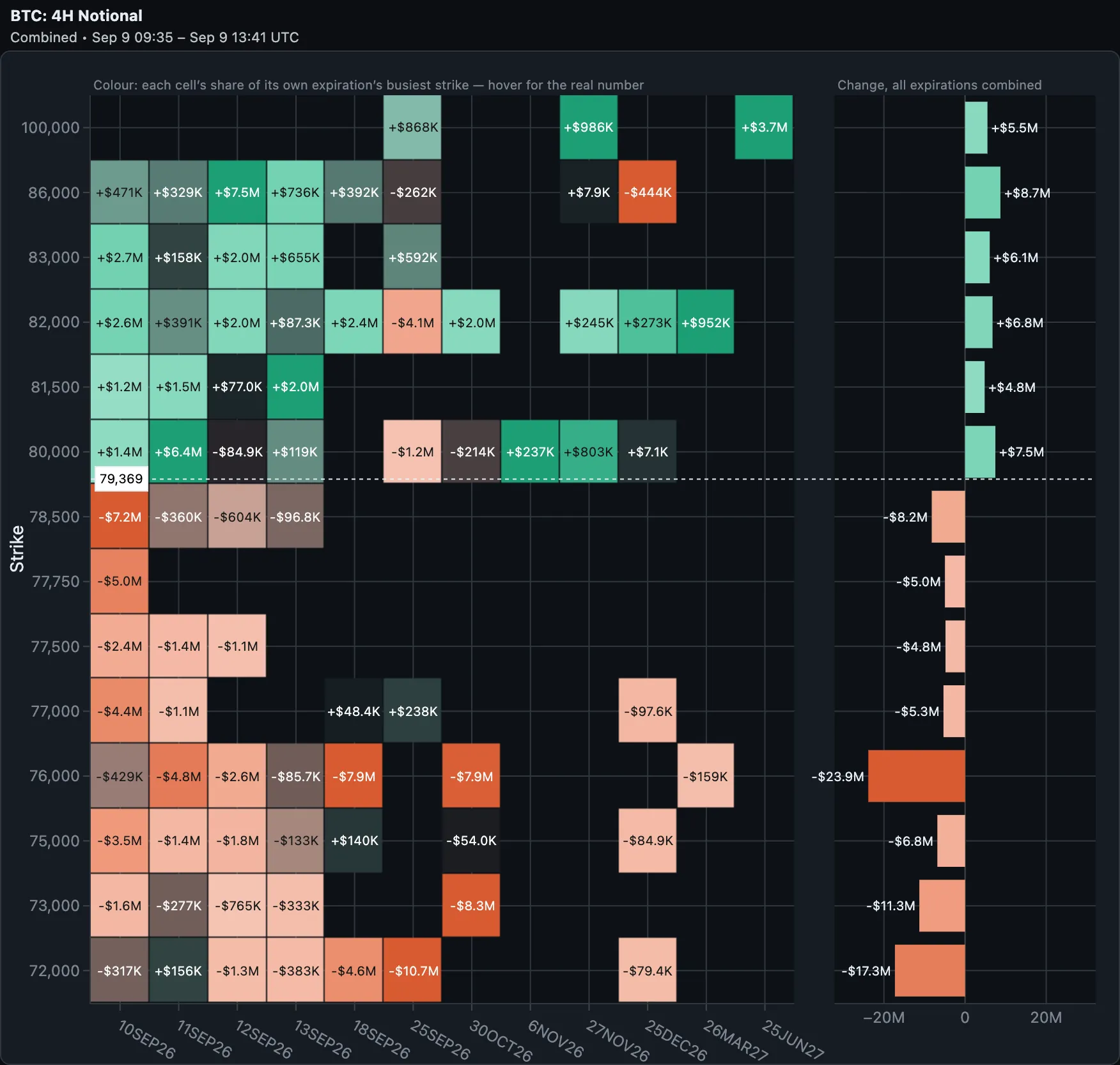
/api/v1/history/levels returns the flip, regime, P1/P2, N1/N2, A1/A2, S/V and net/absolute GEX as a time series: every 15 minutes, hourly, or one row per session close. /history/snapshot returns the full per-strike picture at any moment, and /history/files downloads daily CSV files per symbol: levels, strikes (all expirations combined) and strikes by expiration. History starts on 1 May 2026 for BTC, ETH, SOL and XRP on Deribit, Bybit, OKX and All, on 3 September for HYPE and on 28 September for Derive. It also covers 17 US stocks, ETFs and indices, and new days are added after each session. /history/coverage shows exactly what exists for every symbol. Two limits: option volume isn't stored, and per-strike open interest for US names starts on 14 August (GEX and levels cover the whole period). File downloads have their own daily allowance: 20 on trial, 200 on paid plans. Docs: History API.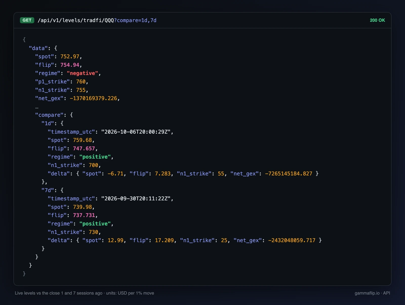
/api/v1/levels returns spot, flip, regime and all the levels in one compact response. Add ?compare=1d,7d,30d to get the same levels 1, 7 and 30 sessions ago with the change, so you can see whether dealers repositioned. /api/v1/me shows your plan, markets and remaining quota.view=levels and range_pct trim the payload, and errors say how to fix the request. For example, asking for a symbol we don't cover returns unsupported_coin with the lists of coins and US tickers that are available./api/v1 endpoints only, as documented, and the app's internal endpoints no longer accept them.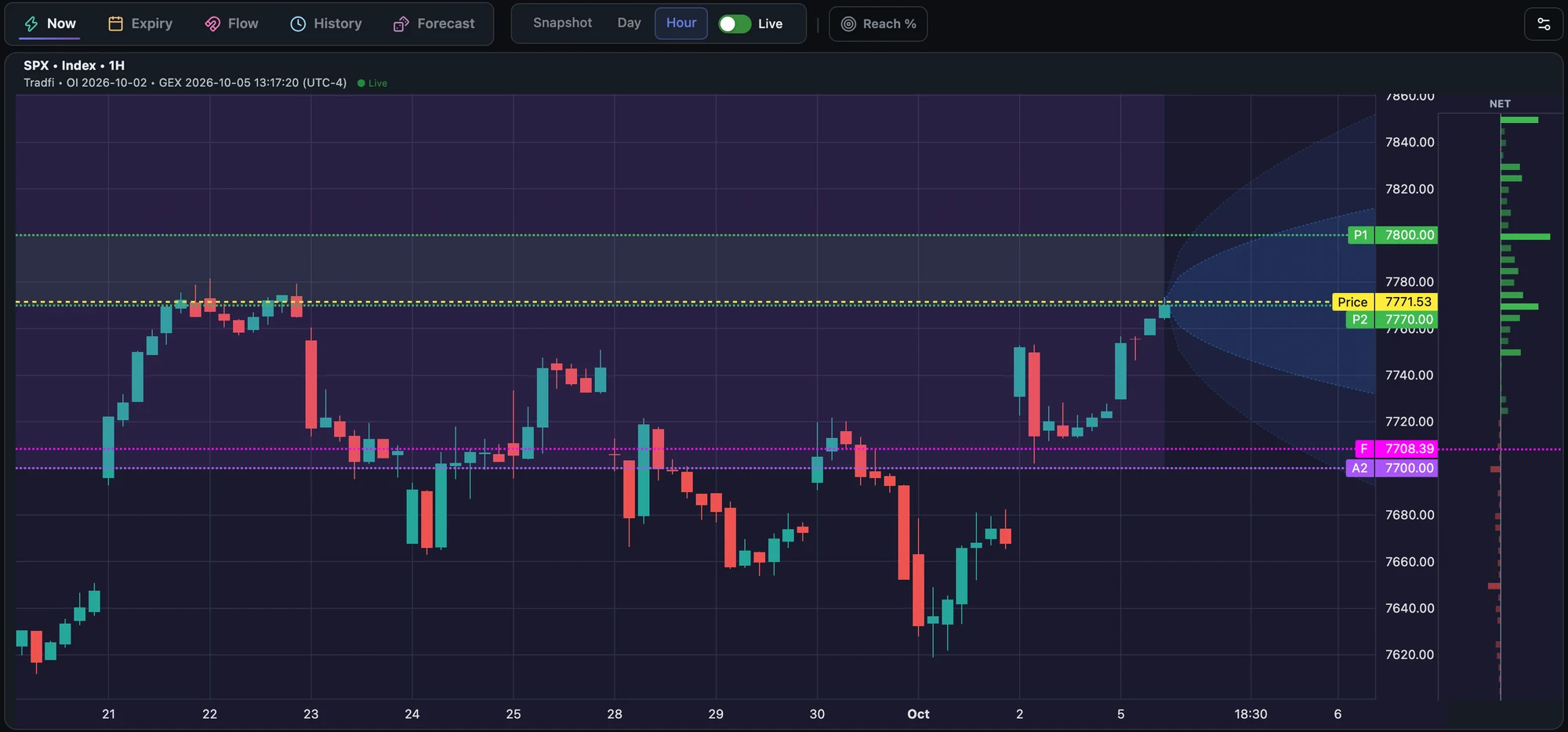
This release only affects you if you use the GammaFlip API — nothing changes in the app.
/api/v1 error now has one shape — a fixed, machine-readable code in error, and human prose in message: {"error": "invalid_exchange", "message": "Exchange 'kraken' is not available."}. Previously error held an English sentence like "Authentication required", so the only way to detect a specific failure was matching text that could be reworded at any time. The codes are unauthorized, subscription_required, market_not_in_plan, invalid_exchange, no_data and rate_limit_exceeded — the same ones our error docs have always promised, but which the API never actually returned. Branch on error; never parse message, its wording can change. Heads-up — this is a breaking change: if your integration matches on the old sentences, it needs updating. If you built against the published docs, it starts working./expirations returned errors disguised as success: An unknown exchange on /api/v1/expirations/... came back wrapped in the normal success envelope, with the error buried inside data. So the obvious client code — response.json()["error"] — worked on the two /gex endpoints and crashed on this one. All endpoints now return an identical, un-enveloped error body.Retry-After on rate-limited responses was unusable: A 429 carried an ISO-8601 timestamp in Retry-After, where the HTTP standard allows only a number of seconds or an HTTP date — so retry libraries (urllib3, axios-retry) that read it automatically would break. The header is no longer sent at all: the daily quota resets at midnight UTC, so the only honest value could be many hours, and those same libraries would obey it by sleeping through your session. Schedule retries off X-RateLimit-Reset (ISO 8601) instead, as the docs already recommend — it's unchanged.market_not_in_plan error: The 403 you get when requesting a market your plan doesn't cover (Crypto vs TradFi) was missing from the published error list. It's now documented, and carries market and current_tier alongside the code.
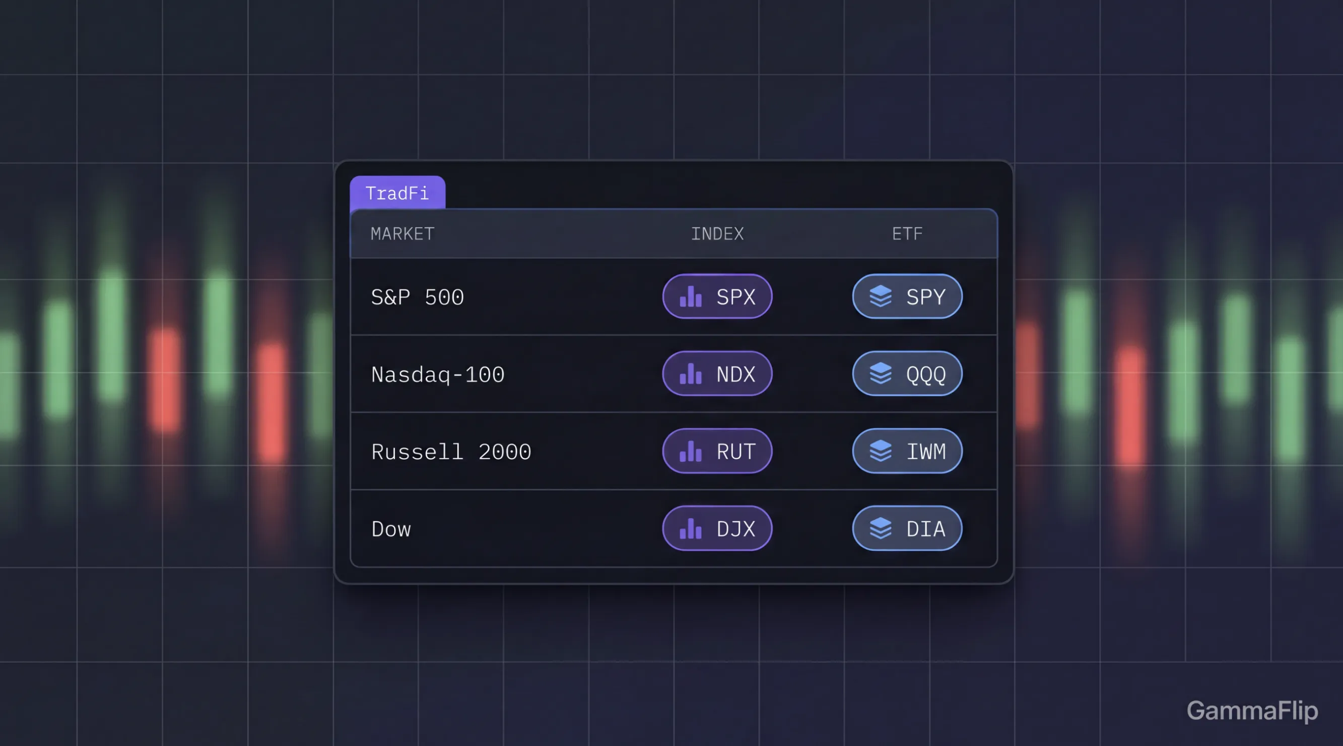
| Market | Index | ETF |
|---|---|---|
| S&P 500 | SPX | SPY |
| Nasdaq-100 | — | QQQ |
| Russell 2000 | RUT | IWM |
| Dow | DJX | DIA |
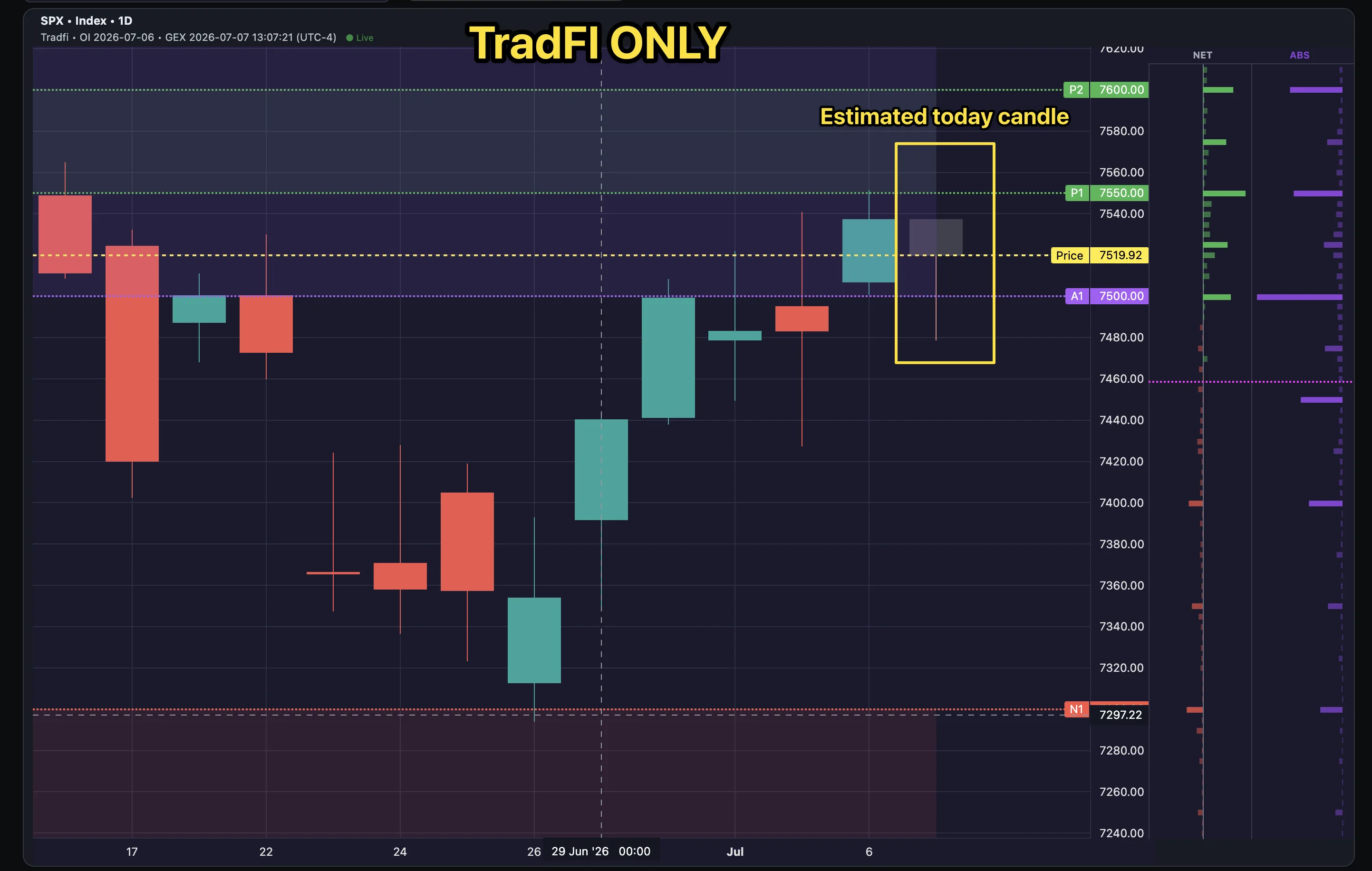
(Bold = new; SPX/SPY and QQQ were already live. Nasdaq-100 is covered via the QQQ ETF.) Why ship both? The index is the "pure" dealer read, but the ETF usually carries deeper option open interest — so its GEX map is denser and often the more tradable of the two. Put them side by side. Flip point, walls, hedging pressure, heatmap and Monte Carlo all work on them out of the box. Open Now → context pill → TradFi.