

Two identical books
Two option books. Same strikes, same open interest, same GEX profile. On every chart in this app until now, they look the same.
In one of them, nothing happened all session. In the other, somebody spent four hours buying puts at every strike below spot.
Those are not the same market. One is a static wall that has been sitting there for days. The other is a wall being built right now, brick by brick, by someone who is willing to pay for downside protection. A snapshot cannot tell them apart, because a snapshot has no memory.
Flow is the tab that remembers. It shows what changed over a window you choose, per strike and per expiration.
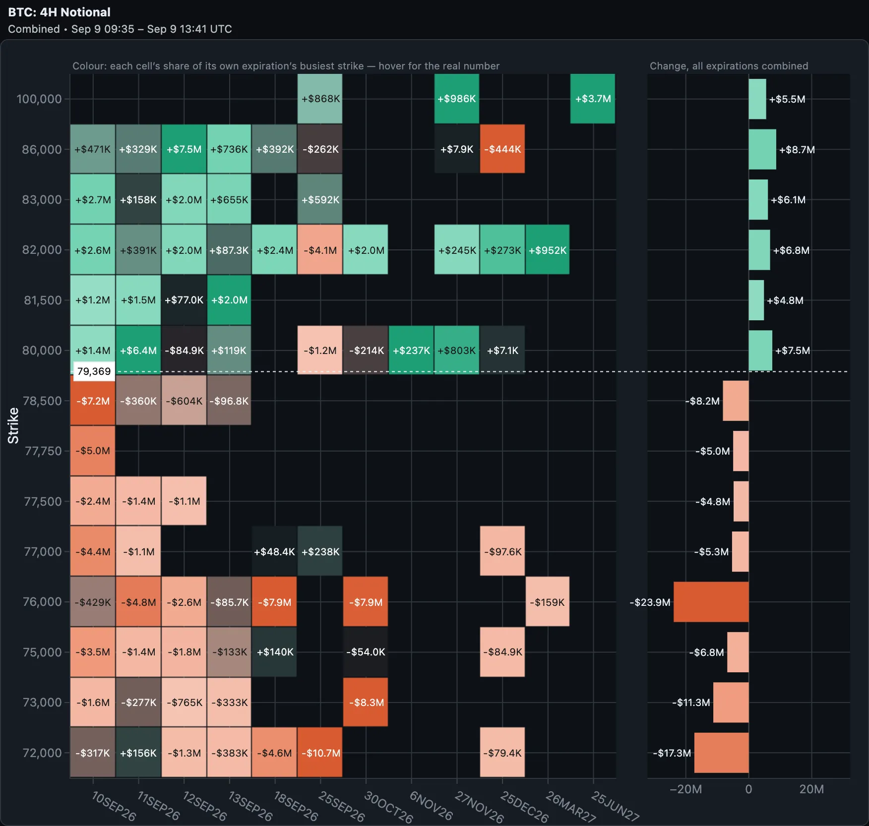 Four hours of BTC, in USD notional. Left: every strike and expiration whose open interest moved, with the size of the move printed in the tile. Right: the same window collapsed across expirations into one total per strike. The two panels share a single strike axis, so a row is the same level in both — the dotted line and the white tag mark spot at 79,369. The split is unusually clean: green above the line, coral below. One warning before you read that coral as selling — under Net, puts count negative. It is not selling. It is puts being built below the market, which the Puts view further down makes explicit.
What Flow measures
For every strike and expiration, Flow takes open interest at the start of your window and open interest now, and shows the difference. That is it. No model, no inference.
That last point matters more than it sounds. Order-flow tools for US equity options have to estimate intraday positioning, because the OCC publishes open interest once a day — nobody gets to see it change during the session, so vendors reconstruct it from trade prints and a set of assumptions about who initiated each trade.
Crypto exchanges publish open interest in the ticker, continuously. GammaFlip polls it every 60 seconds. So for BTC, ETH, SOL, XRP and HYPE, the change you see is measured, not modelled. There is no signing algorithm between you and the number.
The trade-off is the other direction: because US options only publish OI daily, the intraday windows are crypto-only. On TradFi symbols you get the daily windows and nothing shorter.
Two metrics, the same trades
The metric switch changes the units, not the subject.
Notional values the change in open interest in dollars: contracts opened × multiplier × spot. It answers how much capital was deployed here.
Gamma converts the same change into the gamma dealers must hedge, in dollars per 1% move in spot. It answers how much this matters for hedging pressure.
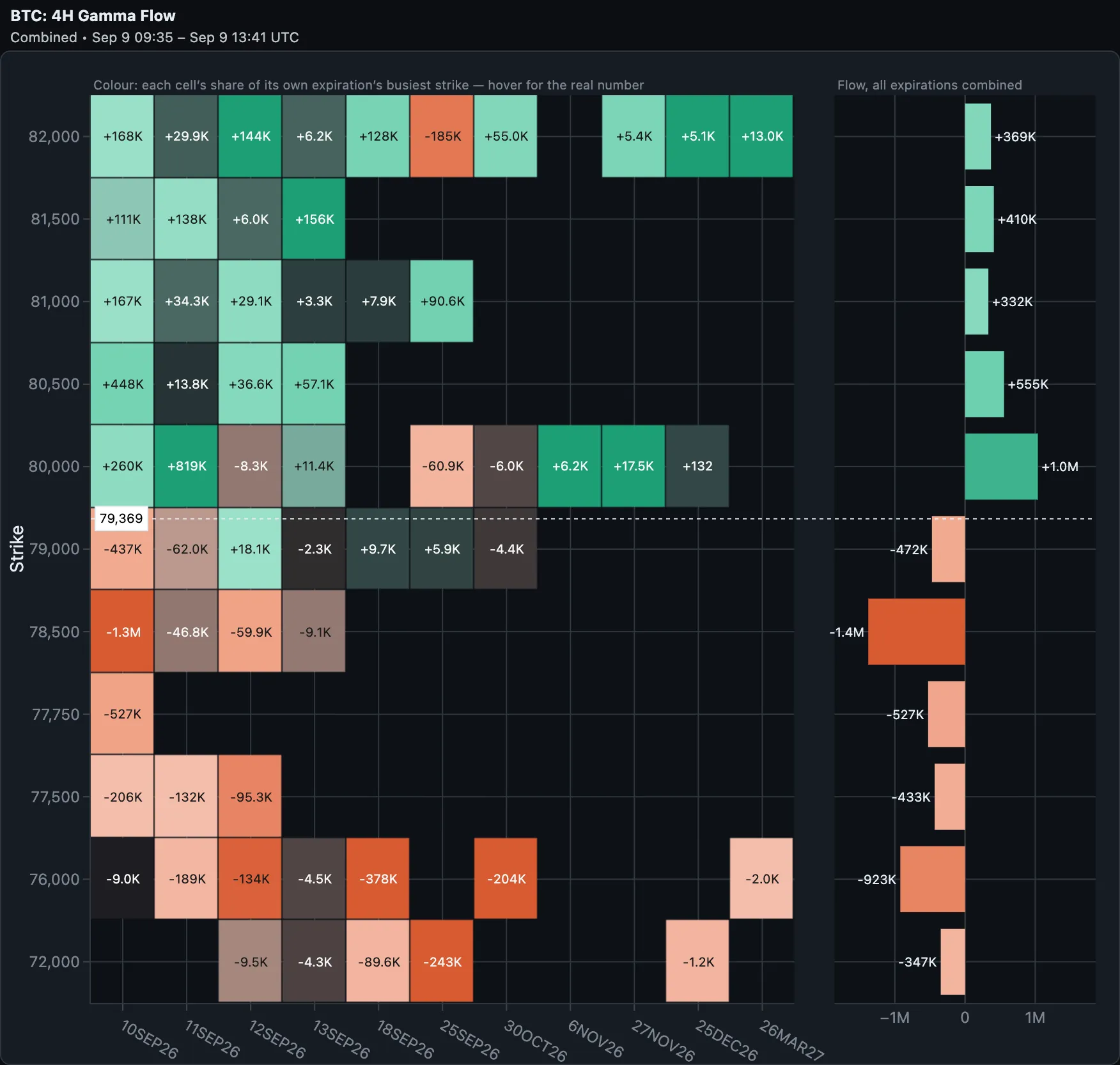 The same window, switched to Gamma. Two differences from the picture above. The grid is sparser — a strike whose open interest never changed has a flow of exactly zero, and a zero is drawn as a gap rather than a tile reading "0.0". And the ranking changes: $23.9M of notional at 76,000 becomes just −$923K of gamma, while 78,500 — barely a third of that notional at −$8.2M — carries the largest gamma move on the board at −$1.4M. Where the money went and where the hedging pressure went are two different orderings — which is the whole reason both metrics exist.
That inversion is not a contradiction — it is what happens when the accumulation is mostly puts. And large notional against small gamma is its own signal: size went into contracts that barely move hedging — usually far-dated, or far out of the money. Someone took a position; nobody has to hedge it yet.
Not the same thing as the History heatmap
A fair question: the History tab already shows GEX over time. Why another chart?
Because GEX can move without anyone trading. Gamma is a function of spot, volatility and time, so an existing position is worth a different amount of gamma every minute of the day. If Bitcoin drops $300, the whole board reprices and the History heatmap shows a different picture — with zero contracts changing hands.
Flow separates the two. It reports the part of the change that came from open interest actually moving, and leaves out the part that came from the market simply being somewhere else. History answers "what does the board look like now, and how did it get here". Flow answers "what did people do".
Calls and puts: the tell
This is where Flow earns its place in a routine. Split the same window by side.
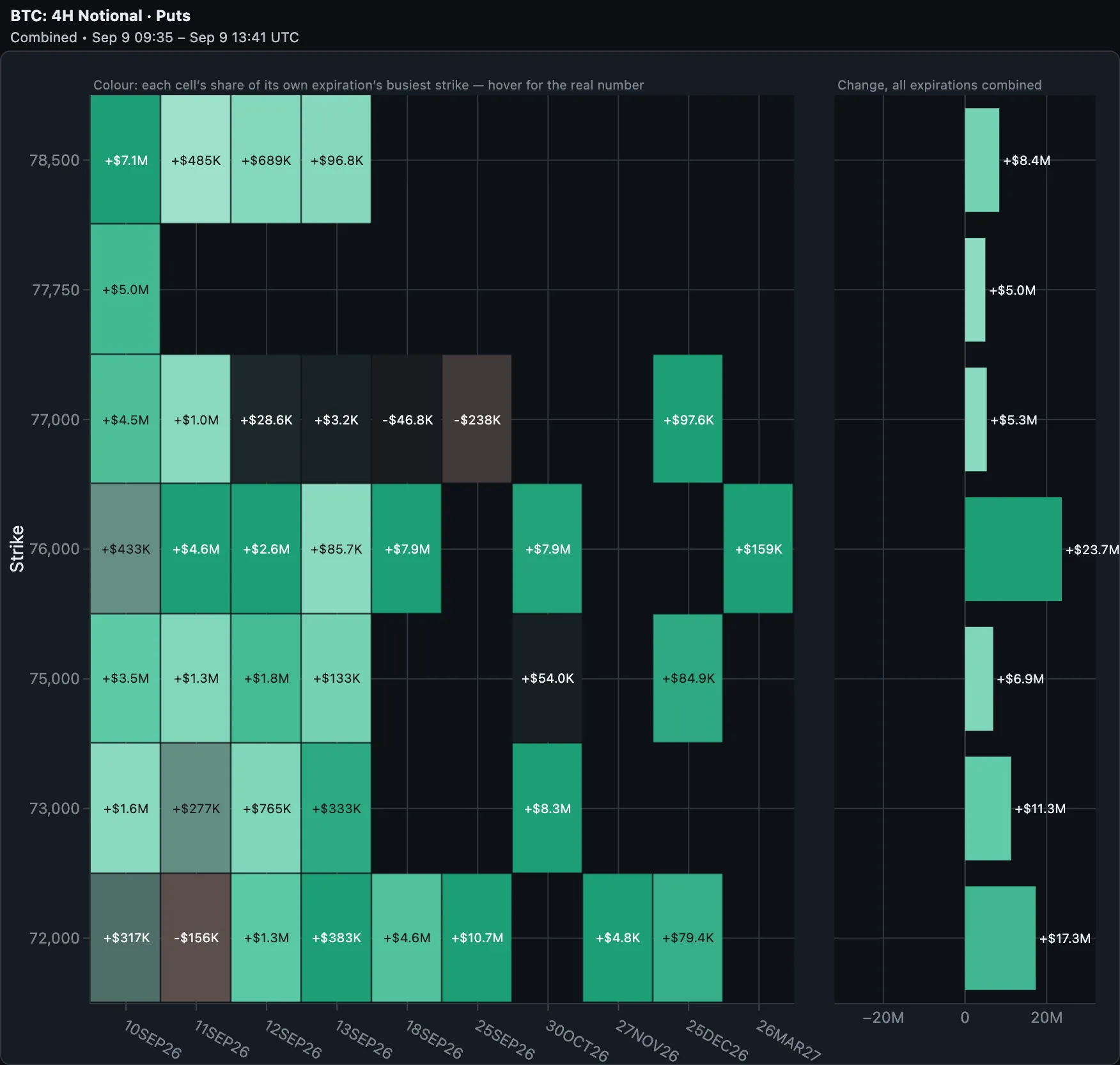 Puts only*, same window. All seven totals are positive, and positive here means built — not one strike saw puts closed. The heavy ones: +$23.7M at 76,000, +$17.3M at 72,000, +$11.3M at 73,000*. Somebody bought protection across the whole ladder beneath the market in four hours, and closed none of it.
Note the sign convention: in Puts mode, positive means puts were built and negative means unwound. That is deliberately different from Net mode, where puts carry a minus because that is what they do to net gamma. When you ask to look at one side on its own, a position being opened should not read as a minus.
Now the other side of the same hour:
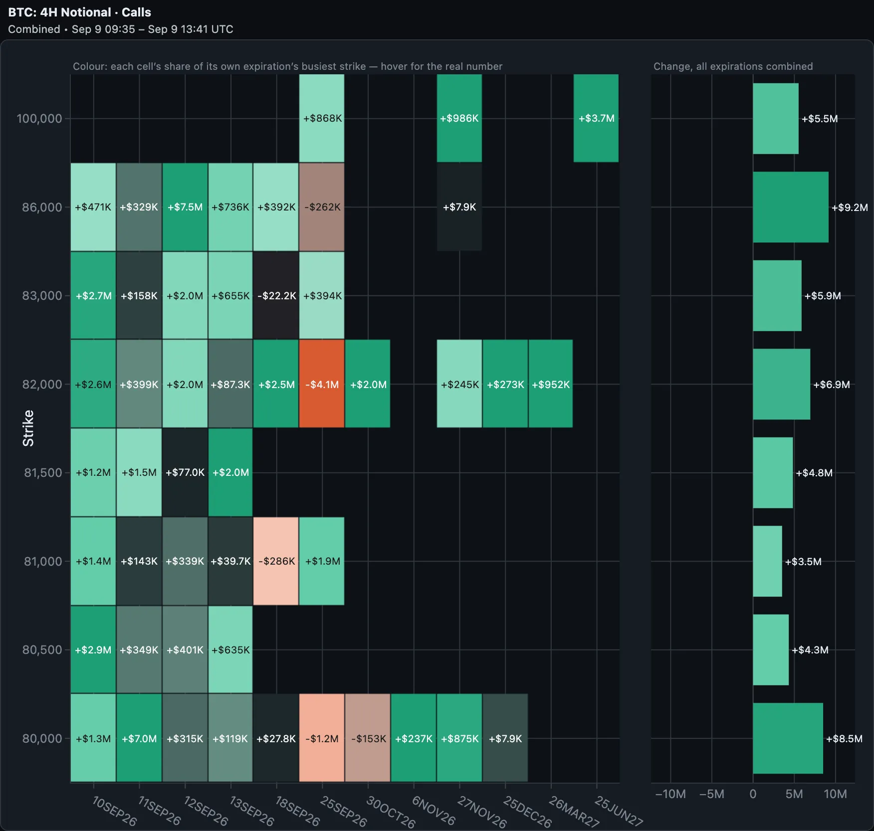 Calls only*, the same window — the mirror image, and just as one-sided. Eight strikes, every one of them above spot, every one of them built: +$9.2M at 86,000, +$8.5M at 80,000, +$6.9M at 82,000, and a lottery ticket at 100,000* worth +$5.5M. Nothing closed here either. Protection bought below the market, upside bought above it, in the same four hours.
Read together, these two pictures say something a snapshot never could. Over these four hours participants paid for protection below the market and for upside above it, and closed almost nothing on either side. That is accumulation, not rotation — and a snapshot taken at the end of it shows only the resulting wall, with no hint that the whole thing was built this afternoon.
The hedging consequence is the part that reaches price. Puts bought below spot are usually sold by dealers, which leaves dealers shorter gamma as price falls toward those strikes — the configuration that amplifies a move rather than damping it. Calls bought above spot tend to work the other way, adding to the positive gamma that pins price. Flow does not tell you who was on which side of the trade, but it does tell you where the inventory moved, and the sign of the gamma that came with it.
The controls
 The three controls you touch while reading, left to right: the Metric switch (Notional ⇄ Gamma), the window, and the side. Metric comes first because it is the frame everything else is read in.
Everything you change while reading sits on the toolbar:
- Metric — Notional or Gamma, as above. It is first because it is the frame everything else is read in.
- Window — 15m, 1H, 4H, 1D, 2D, 1W, 1M. The window is the chart: every number on screen is now minus then. 1M is one options cycle: a week shows the current churn, a month shows which walls were actually built or taken down between monthly expiries. The subtitle under the title always shows the period actually measured, which can be shorter than the one you asked for when history does not reach back that far yet. US options get 1D, 2D, 1W and 1M only, counted in trading sessions — open interest is published once a session, so weekends and holidays are skipped, and the subtitle shows the session count.
- Side — Net, Calls, Puts.
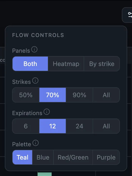 The settings you pick once and leave alone. Panels narrows the figure to one half; Strikes and Expirations control how dense it is; Palette is purely cosmetic. The ⓘ beside each label opens that control's help entry.
The gear holds the settings you choose once and leave alone:
- Panels — both, or narrow the figure to the heatmap or the by-strike bars alone.
- Strikes — keep only the strikes carrying 50/70/90% of the total change. A full BTC chain lists around 90 strikes, most of them empty; at 70% the ones that matter get real pixels. The bar totals are always computed over the complete set before this filter runs, so trimming the view never changes a number.
- Expirations — cap the columns, nearest first. Bounding how far down the term structure you look, not chasing the biggest movers.
- Palette — cosmetic. Blue is the colour-blind-safe pair.
One note on colour: each cell is shaded relative to the busiest strike in its own expiration column, not against the whole grid. Gamma falls off roughly as 1/√T, so a single scale would light up the front month and wash out everything behind it — and a large far-dated build is exactly the thing this chart exists to surface. The consequence is that colour tells you unusual for this tenor, and the number in the cell tells you how much.
Three reads you can do today
Is that wall being built or abandoned? Find the biggest wall on the Now tab, then look at the same strike in Flow over 1D. A wall with flow still going into it is a level with a live sponsor. A wall with flow leaving it is yesterday's position, and it will matter less tomorrow than the snapshot suggests.
Is protection being bought into an event? Switch Side to Puts and step the window out to 2D. Accumulation spread across strikes below spot, rather than concentrated at one, is the signature of hedging rather than a directional bet.
What is the far end of the curve doing? Gamma's 1/√T decay means a big far-dated build barely registers on a GEX snapshot — it is real money that will not show up as hedging pressure for months. Flow's per-column colouring makes it visible on the day it happens.
What Flow will not tell you
It is worth being precise about the limits.
Flow sees open interest change, not trade direction. A strike gaining 20 contracts tells you a position was opened; it does not tell you whether the customer was the buyer or the seller. Adding that requires a trade feed with quotes attached, which is a different piece of work.
Expirations that settle inside your window are excluded, not shown as a giant unwind — their open interest going to zero is settlement, not somebody closing a position.
Longer windows need history to exist. The 1W and 1M windows can only answer once a week or a month of open-interest history has accumulated behind them.
And Flow is a companion to the snapshot, not a replacement. The snapshot tells you where the pressure is. Flow tells you which way it is moving. Neither is much use without the other.
Flow lives between Expiry and History in the chart navigation. It covers BTC, ETH, SOL, XRP and HYPE on Deribit and Bybit, and BTC and ETH on OKX — each exchange on its own, or merged in the combined view.
Ready to see GEX in action?
Try GammaFlip.io and experience professional-grade gamma exposure analysis
Open Dashboard