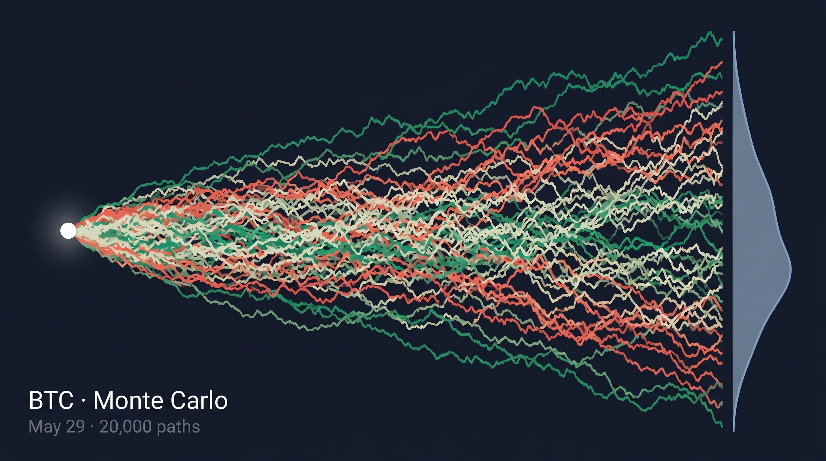
Monte Carlo Simulator: Forecasting Where BTC Might Land by Expiry
Every other chart in GammaFlip answers the same question: where are the levels?
The Monte Carlo Simulator answers a different one entirely:
How likely is BTC to be above (or below) a specific level on a specific date?
The simulator generates 20,000 possible price paths from now to your chosen expiry, bends each one with the current GEX surface — positive-gamma zones gently compress moves, negative-gamma zones gently amplify them — then turns the cloud into five numbers and one interactive readout you can actually trade against. Unlike the closed-form ±1σ Expected Move cone, this one already accounts for dealer hedging structure.
Here's what it looks like on screen:
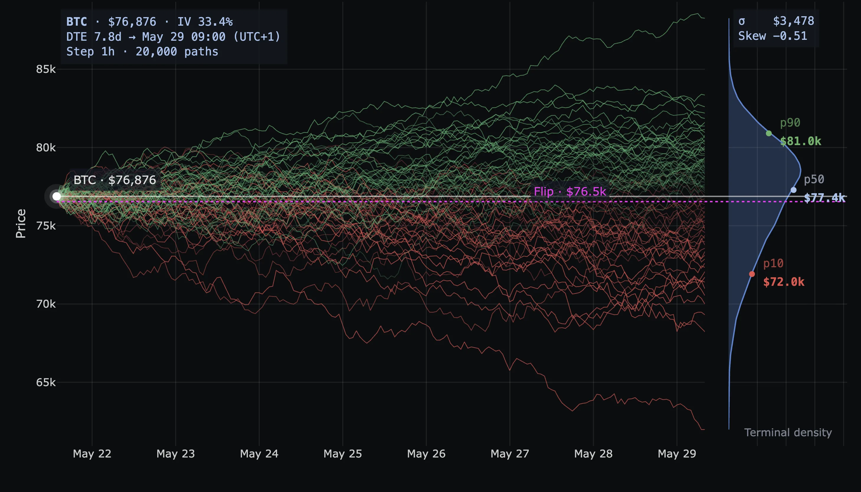 BTC Monte Carlo, 7.8 DTE to May 29. Spot $76,876 · IV 33.4% · σ $3,478 · Skew −0.51. Paths fan out from spot; terminal price distribution shows up as a kernel-density curve on the right; p90 $81.0k / p50 $77.4k / p10 $72.0k anchor that density. The magenta Flip line at $76.5k sits just below spot — current regime is barely positive-gamma.
The five numbers that matter
Forget the visual flair. The chart carries five pieces of signal:
| Number | What it is | How to read it |
|---|---|---|
| p50 | Median terminal price | Half the paths end above, half below. The center of mass. |
| p10 | 10th percentile | Only 10% of paths end below this. Reasonable downside. |
| p90 | 90th percentile | Only 10% end above. Reasonable upside. The interval p10→p90 contains 80% of outcomes. |
| σ | Standard deviation, in dollars | Width of the cone. Bigger σ = more uncertainty. |
| Skew | Distribution asymmetry | Negative = longer downside tail. Positive = longer upside tail. |
Three quick reads off this table alone:
- p50 vs. spot. If p50 sits above spot, the GEX-warped distribution leans bullish before you do anything else.
- p10 → p90 width. Your realistic range. If your target is outside it, you're betting on a tail.
- σ vs. closed-form Expected Move σ. Smaller MC σ means gamma is containing the move; larger means gamma is feeding it. This single comparison is one of the most underrated readouts on the platform.
Hover to ask "what are the odds?"
This is the feature most users miss on the first pass, and it's the most useful thing on the chart.
Hover anywhere on the plot. The simulator draws a √t cone boundary from spot to your cursor, shades the tail beyond it, lights up the matching slice of the terminal density on the right, and tells you exactly how many paths end up in that tail.
Hover above the median → upper tail shades green, plate reads ≥ $X · Chance: N%. Hover below → lower tail shades red, plate flips to ≤ $X · Chance: N%. The shading switches sides automatically; the probability comes from the smoothed terminal density (not the discrete percentile grid), so you get useful numbers all the way out to the tails.
This is what makes the chart practical in a trade plan. You don't have to mentally interpolate between p10, p50, and p90 — just hover the level that matters:
- Hover your take-profit.
≥ $X · Chance: N%— your win-rate estimate at expiry. - Hover your stop.
≤ $Y · Chance: M%— your structural stop-out probability. - Hover a wall (P1, P2, the next A-line). How likely is price to even reach it by Friday? If the answer is 5%, your trade isn't fading the wall — you're fading the cone.
- Hover the Flip. Probability of a regime flip by expiry. One of the highest-information reads on the platform.
The percentile labels (p10/p50/p90) anchor your at-a-glance read. The hover is the precision tool. Use both.
Sigma and skew, demystified
σ in the Monte Carlo panel is not the same number as the ±1σ band on the Expected Move cone. Both are standard deviations. Both have the same statistical meaning. But Expected Move's σ is closed-form (IV × √t math), while Monte Carlo's σ is the empirical standard deviation of the simulated terminal distribution — after GEX warping. The delta between the two is exactly how much positioning structure is dampening or amplifying volatility.
Skew is even more underrated. A skew of −0.51 (the example screenshots above) is not a rounding artifact. It means the terminal distribution has a meaningfully longer downside tail than upside.
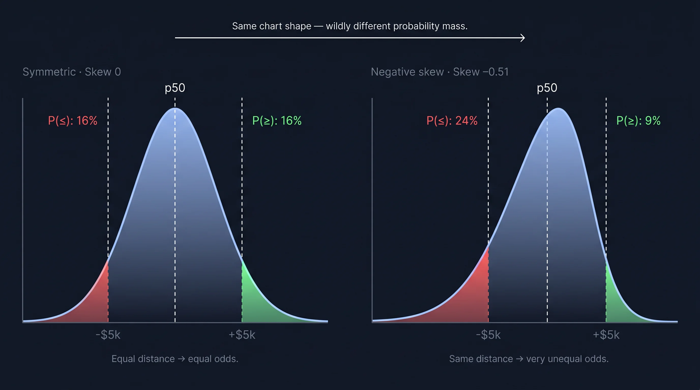 Same chart shape — wildly different probability mass. A skew of −0.51 puts roughly 2.7× as much mass in the downside tail as in the upside. Equidistant in price, very unequal in odds.
Two practical implications:
- A symmetric stop / take-profit setup is not a symmetric bet. Equal nominal distance, very different odds. Hover ±$5k around p50 in the app and the asymmetry shows up directly on the plate.
- If you're long, your hedge cost is non-trivial. The market is pricing this asymmetry — that's where 25Δ Risk Reversal lives (the implied-vol skew between 25-delta calls and puts — negative when puts are richer, i.e. the market is paying for downside protection). Negative MC skew and negative 25Δ RR are two different lenses on the same fear.
Symmetric chart, asymmetric distribution: that's the trap skew catches.
GEX Impact: Light, Normal, Strong
This is the only knob that changes the simulation itself. Palette and Horizon are scope and cosmetics — GEX Impact changes how much the dealer gamma surface bends the random walks.
- Light — almost a pure log-normal walk seeded by ATM IV. GEX walls barely deflect paths. Use it when the GEX surface is noisy, price is sitting on the Flip, or you want a baseline expected-move read with minimum model dependency.
- Normal — the calibrated default. Moderate attraction toward positive-gamma zones, moderate push from negative-gamma zones. Use this 90% of the time.
- Strong — amplified warping. Paths cluster aggressively near major GEX walls; gamma-vacuum strips get avoided. Treat it as a stress test, not a base case.
Switching modes triggers a re-run. σ and skew will update — sometimes meaningfully. That's not the simulator being unreliable; it's the simulator telling you how much of your "expected move" is driven by the GEX assumption versus raw IV. If σ swings hard between Light and Strong, you're sitting on a heavily positioning-dependent forecast.
Palette is cosmetic — Direction (R/G) is the easiest read; Viridis/Plasma color by magnitude of move; Mono fades paths and lets the density and hover plate do the talking. Same simulation under all five.
Horizon picks the date the simulator forecasts to and the ATM IV that seeds the walk. The GEX side always uses TOTAL. Short horizons give narrow, trustworthy cones; far horizons (≥30 DTE) get so wide the probabilities collapse to "anything could happen."
When the simulator misleads
- First few hours of a new expiry cycle — IV is jumpy, GEX hasn't settled. Wait an hour.
- Major macro / news event imminent — the model has no idea CPI is at 8:30.
- Price sitting on the Flip — sticky and jumpy fight for control; drop to Light, or check the closed-form Expected Move cone instead.
- Thin chains — if only a few strikes have OI, the gamma surface is essentially noise. Strong mode will produce confident-looking garbage.
The simulator is at its strongest in the 2–10 DTE window, in a clearly identified regime, with a well-populated chain. That's also where most short-term traders live.
Using it in a trade plan
The 5-second read on any Monte Carlo chart:
- p50 vs. spot — direction of the model's drift.
- p10 → p90 width — realistic range.
- Skew sign and magnitude — if |skew| > 0.3, note which side the tail leans.
- GEX Impact mode — on Strong, halve your confidence in the precise numbers.
- Hover trigger, target, stop — read the probabilities off the plate.
Translation into a trade idea:
"The model assigns 6.4% probability to BTC closing ≥ $81.6k by Friday; my long-call structure pays 20× if it does; the expected value is positive."
Probabilities × payouts. The hover gives you the first half; the trade structure gives you the second. That's fundamentally different from "I think BTC bounces here."
Monte Carlo is weakest as a prediction engine and strongest as a sanity check. It doesn't tell you where price will be on Friday — it tells you which trade ideas are structurally reasonable, and which are betting on a tail.
What's already out there
Before launching this we surveyed every major crypto-options platform with a GEX dashboard. Several surface gamma exposure clearly — none simulate price paths warped by the live gamma surface. Academic work on gamma-aware simulation exists (Avellaneda & Lipkin's pinning paper; the recent beta-dependent gamma feedback SDE framework) — but it lives in papers, not products.
So when we say "the first GEX-warped Monte Carlo simulator in crypto," that's the careful version: nobody in the crypto market productizes it. That gap is why this chart exists.
Ready to see GEX in action?
Try GammaFlip.io and experience professional-grade gamma exposure analysis
Open Dashboard