Six Small Features That Make GEX Easier to Read
The big charts — Strike, Profile, Heatmap — get all the attention. But the controls you actually touch every day are the small ones. Here are six that cut noise or add context, so the signal stands out faster.
We've grouped them two ways: three that declutter the chart, and three that help you read it in context.
Declutter the chart
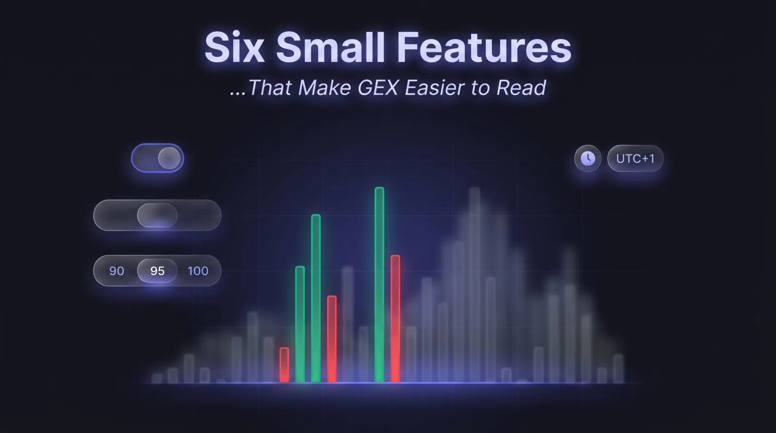
1. Smart bar width
By default, every bar on GEX by Strike is the same width, no matter how far apart the strikes sit. Smart bar width scales each bar to the actual spacing between strikes — a $2,000 gap reads twice as wide as a $1,000 gap.
The payoff: you see where gamma is genuinely dense versus where it's spread thin across a sparse part of the book, instead of a misleadingly uniform wall. Leave it on; it's especially useful when the book mixes tightly-spaced weeklies with widely-spaced monthlies.
2. Strike concentration
A book can list dozens of strikes, most of them carrying almost no gamma. Strike Concentration trims the chart down to the strikes that actually matter.
Pick 90, 95, 99 or 100%, and the app keeps only the strikes that together account for that share of total absolute GEX — the long tail of near-zero strikes drops away. Sort by impact, in effect. Drop to 90% to make the dominant walls pop; snap back to 100% when you want the full picture. The filter is purely visual — it never changes the underlying GEX.
Tip
Where to find them: Smart bar width and Strike concentration both live in the ⚙ Controls popover — open it from the gear in the chart nav bar, on the GEX by Strike view. They used to sit in global Settings; now they're one click from the chart they affect.
3. Marker multi-selection
Markers — flip point, gamma walls, max pain, regime — are powerful, but they stack up fast and turn the chart into a tangle of lines. Now you can pick exactly which marker groups show, toggling several at once.
Show only the levels you're trading around for this setup, hide the rest, and the chart goes quiet again.
Read it in context
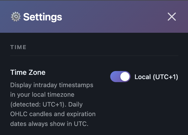
4. Display time zone
Intraday timestamps default to UTC — the market's clock, but rarely yours. Flip the Time Zone toggle in Settings and every intraday axis, crosshair and label switches to your local time.
Now "the 3pm dump" lines up with your wall clock instead of a mental UTC conversion you'll occasionally get wrong. Daily candles and expiration dates stay in UTC on purpose — those are the market's clock.
5. Time Machine (replay)
GEX is a snapshot — but the structure tells a story over time. Time Machine lets you scrub back through past snapshots and watch the walls build, the flip point migrate, and the regime turn over, frame by frame.
It's the fastest way to understand how today's setup actually formed — and what the book did last time price approached a level like the one you're watching now.
6. Expected move cone
On the OHLC view, the Expected Move cone overlays the options-implied range around price — a probabilistic corridor for where the market is pricing the next move.
Read it alongside the gamma walls: when a wall sits inside the cone, it's a level price can realistically reach before expiry. When it sits well outside, the market isn't pricing a move that far — useful context before you lean on a distant target.
Go turn them on
None of these are buried. Smart bars and Strike concentration live under the ⚙ Controls in the chart nav bar; marker groups toggle on the strip below the chart. Time Zone is in Settings. Time Machine and the Expected Move cone sit on the chart toolbar itself.
Spend thirty seconds switching them on. Individually they're tiny; together they make every daily read quieter, faster, and a little harder to misread.
Ready to see GEX in action?
Try GammaFlip.io and experience professional-grade gamma exposure analysis
Open Dashboard