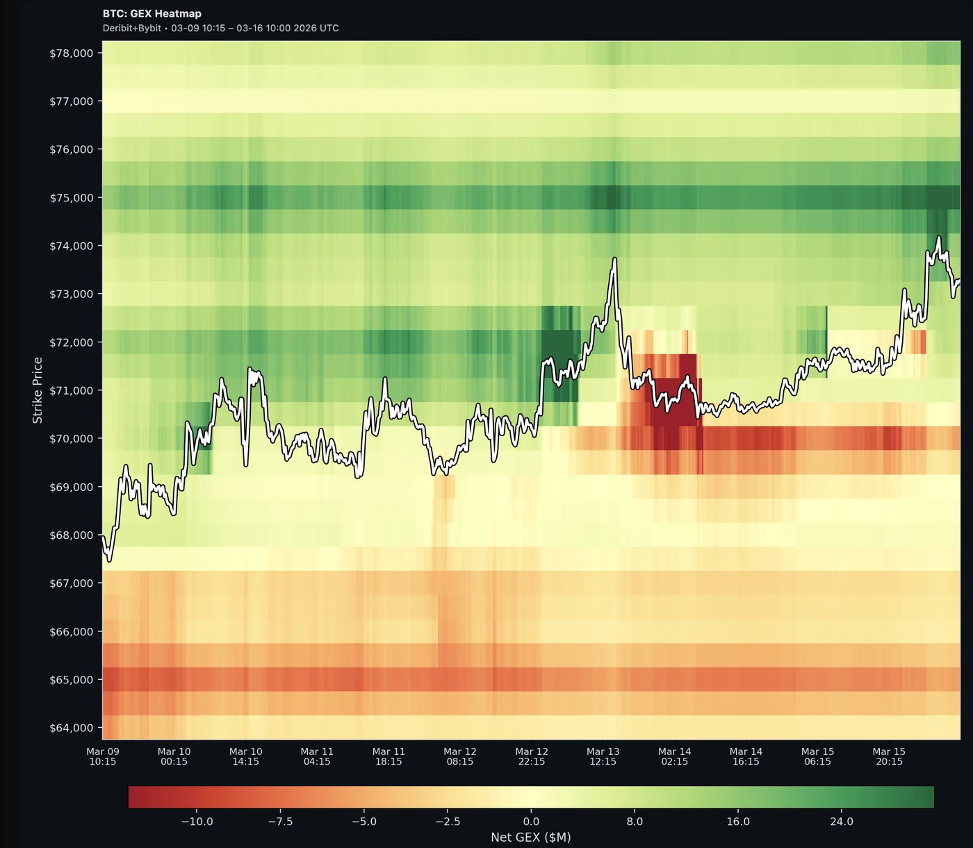
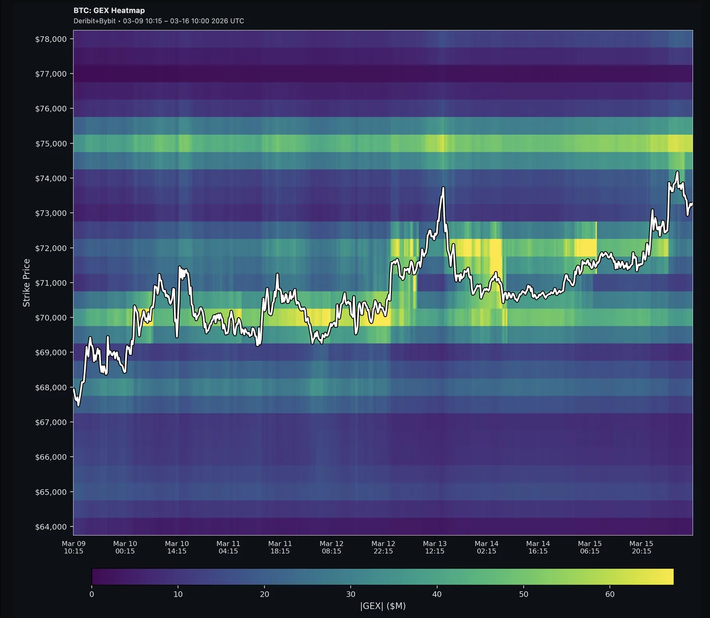
GEX Heatmap (Time × Strike)
2D raster of gamma exposure over time (X) and strike price (Y). Shows how GEX evolves across hours and days.
The GEX Heatmap chart plots gamma exposure as a color-coded 2D grid with time on the X-axis and strike price on the Y-axis.
Net GEX — green = positive gamma (stabilizing), red = negative gamma (amplifying):
|GEX| — brighter = higher absolute gamma regardless of direction:
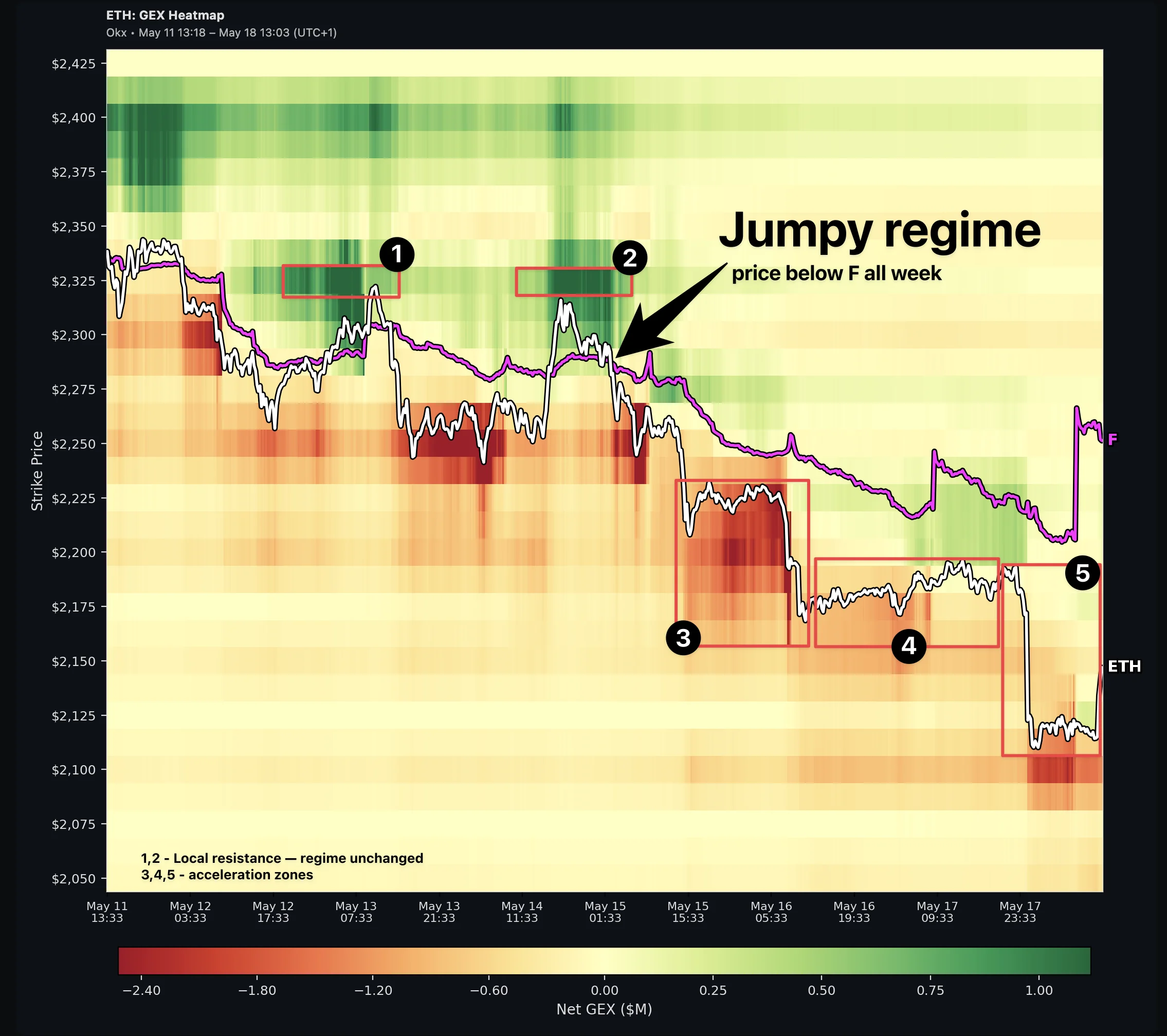
Flip Point (F) overlay: A magenta line tracks the gamma Flip Point through time — the strike where dealer gamma crosses zero. Price above F sits in a Sticky regime (positive gamma, mean-reversion); below F is Jumpy (negative gamma, amplification). Both lines are labeled at the right edge: the coin symbol on the price line, F on the flip line, so you can tell them apart at a glance. Toggle the overlay via the FLIP control in the chart toolbar — on by default.
Time ranges: 24H, 3D, 7D, 30D, 90D — longer ranges show broader structural shifts, shorter ranges capture intraday dynamics.
How to read it:
- Horizontal color bands that persist across time = sticky gamma levels (strong support/resistance)
- Color shifting from green to red (or vice versa) = regime change at that strike
- Bright spots clustering near current price = high hedging activity zone
- Price line crossing the F line = regime flip; sustained moves on the opposite side often follow
Not to be confused with: The ABS GEX Heatmap (visible on the Strike chart below the bar chart) shows a snapshot comparison of current gamma vs. 24h/48h/7d changes — a different view entirely.
See also: GEX by Strike, GEX Change Table