What GammaFlip shows in 60 seconds
Understand that the bars on the GEX chart mark where price is likely to react.
Open GammaFlip right now and look at the chart. You'll see a column of colored bars next to a price axis.
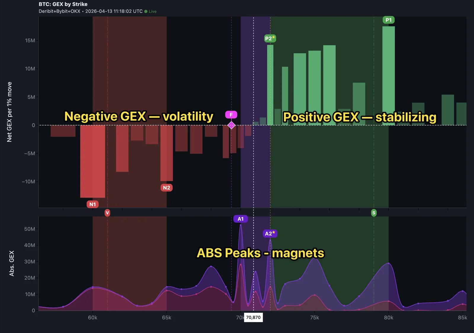
That's it. That's GEX (Gamma Exposure).
Each bar answers a single question: at this price level, are market forces likely to slow price down or push it further?
Green bars — stabilizing zones
A green bar means the market structure at that price level creates stabilizing pressure. Think of it as a magnet.
- Price approaches a tall green bar from below → tends to stall or reverse
- Price is above a tall green bar → that level tends to act as support if price dips
- The taller the bar, the stronger the stabilizing force
You don't need to understand why yet. Just remember: green = magnet.
Red bars — volatility zones
A red bar means the market structure at that price level creates amplifying pressure. If price reaches a red zone, moves tend to accelerate.
- Price breaks into a red zone → momentum often picks up
- Red zones can act as gaps where price travels quickly
- The deeper the red, the more reactive the zone
Remember: red = accelerant.
The one number that changes everything
Look for the horizontal line that separates the green territory from the red territory. That's the Flip point.
- Price above the Flip point: you're in a sticky market. Levels hold better. Ranges compress.
- Price below the Flip point: you're in a jumpy market. Levels break. Moves extend.
You'll learn how to use this properly in the next lesson. For now, just know it exists.
Your 60-second read
Next time you open GammaFlip, do this:
- Find the tallest green bar — that's P1, the strongest stabilizing level
- Find where the chart flips from green to red — that's the Flip point
- Note which side of the Flip point price is on right now
Three pieces of information. Thirty seconds. You now know more about what the market structure looks like than 95% of traders looking at a bare price chart.
Open the app and try it: identify P1 and the Flip point on today's BTC chart before moving to the next lesson.
Check your understanding
What does a tall green bar on the GEX chart mean?
It marks a level where market forces tend to stabilize price — a likely area for reversals or stalls.
If you see mostly green bars above the current price and mostly red bars below, what's the immediate interpretation?
Price is approaching a stabilizing zone from below. There's likely resistance ahead, so be cautious adding to longs near those green bars.