
A New Way to Read GEX
GEX is a four-dimensional dataset stuffed into a two-dimensional screen. Strikes, expirations, time, and what could happen next — all competing for the same pixels. Until now, our chart nav forced you to think in terms of chart types: Heatmap, Term, Monte Carlo. That worked, but it asked the wrong question. You don't open the app thinking "I want a heatmap." You open it thinking what is this market doing right now? — or how did it get here? — or what comes next?
So we regrouped everything around the question, not the chart.
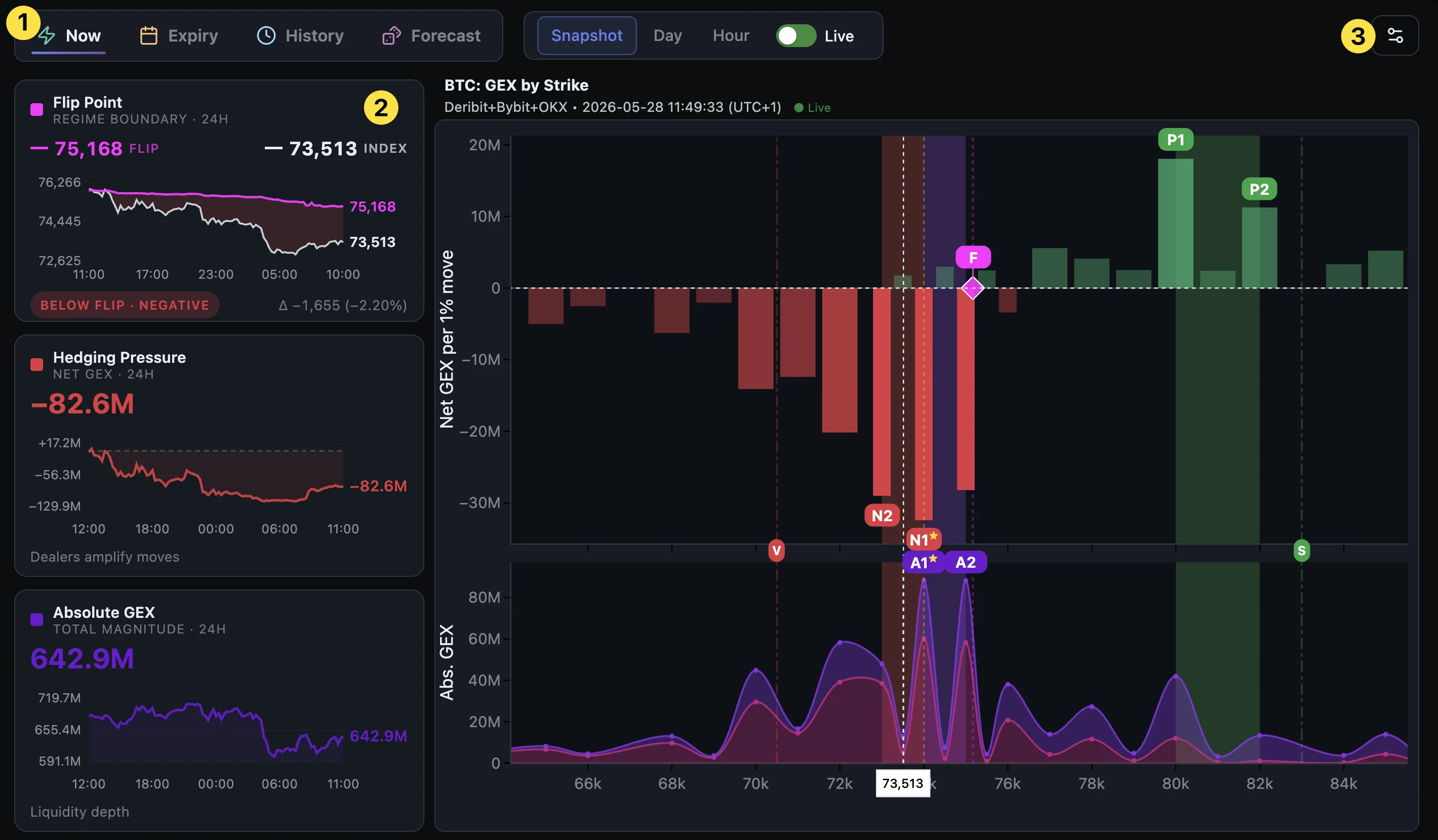
Three things to notice in the new layout (above): ① the four category tabs along the top, ② the Dealer Pulse rail down the left edge, and ③ a single gear button at the top-right for secondary controls.
Four questions you can ask about GEX
Every view in the app now sits under one of four categories, and each category is really a question about time:
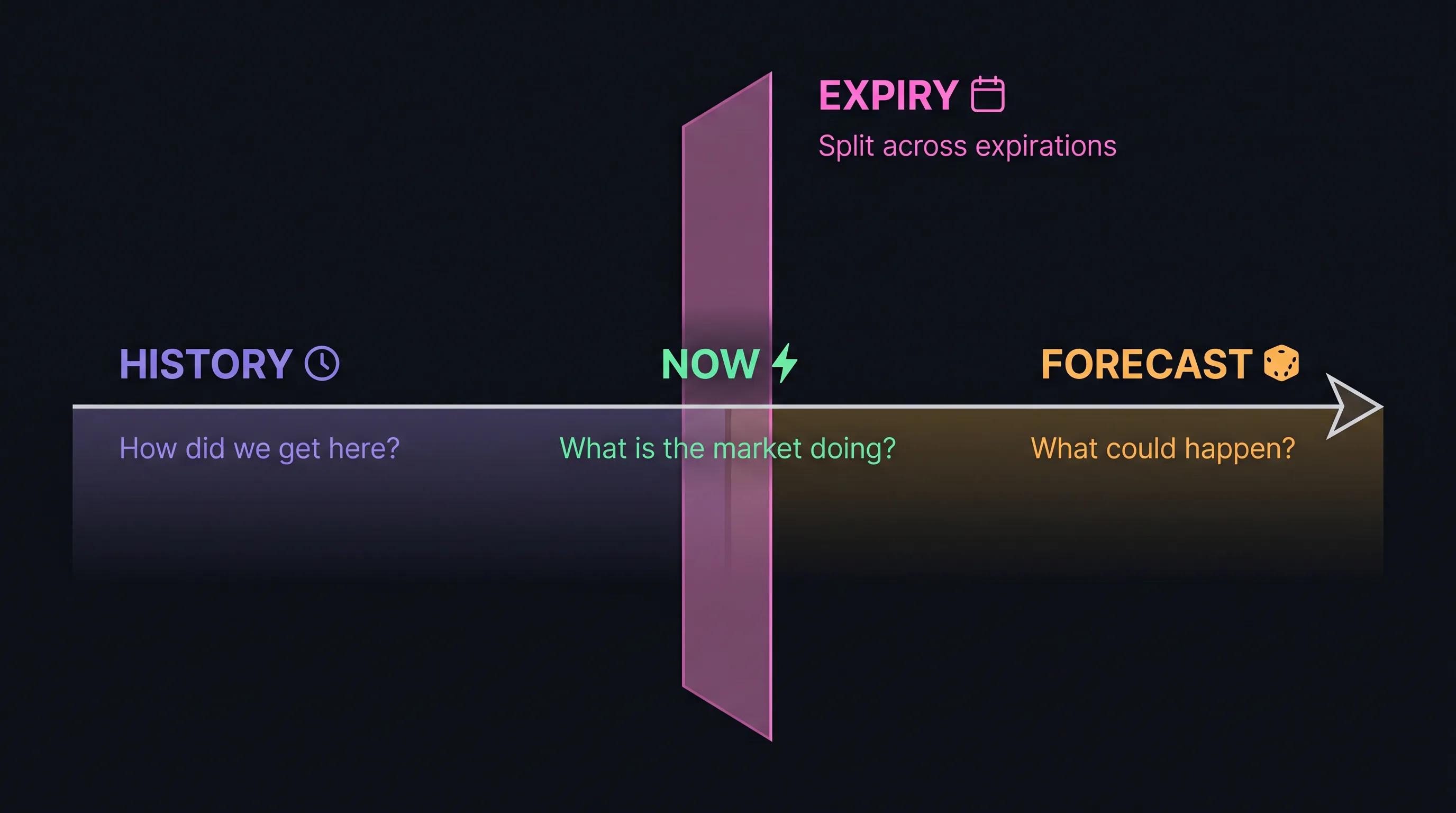 The four categories are four temporal lenses on the same underlying dataset.
-
⚡ Now — Where are dealers hedging right now, by strike? Snapshot of the current GEX-by-Strike profile, plus optional OHLC overlays for the day or the last hour. This is the default view, and most reads start here.
-
📅 Expiry — How is that pressure split across upcoming expirations? Positioning across the term structure, plus per-expiration Levels. Use it when you need to know whether a wall belongs to this Friday or to a quarterly two months out — the difference matters for decay and for who actually has to hedge.
-
🕰️ History — How did it evolve? The heatmap, now scoped by window: 24H, 3D, 7D, 30D, 90D. Toggle between Net GEX (regime map) and Absolute GEX (concentration map). This is your "what changed" view.
-
🎲 Forecast — What could happen? Monte Carlo price simulations with adjustable GEX impact (Light / Normal / Strong), and the Hedging Pressure profile that shows how dealer flow would respond to hypothetical future prices. This is where "what if BTC pushes to 80K?" gets a real answer.
The sub-views inside each category adapt to context — Window appears only inside History, GEX Impact only inside Forecast, and so on. No more scanning irrelevant controls.
The Dealer Pulse rail
The other major addition is the Dealer Pulse — the new column of mini-charts down the left edge. Think of it as a live ECG for dealer positioning. Whatever you're looking at in the main panel, the rail keeps showing you the same picture, evolving over the last 24 hours: two confirming views of the regime, plus one independent read on liquidity.
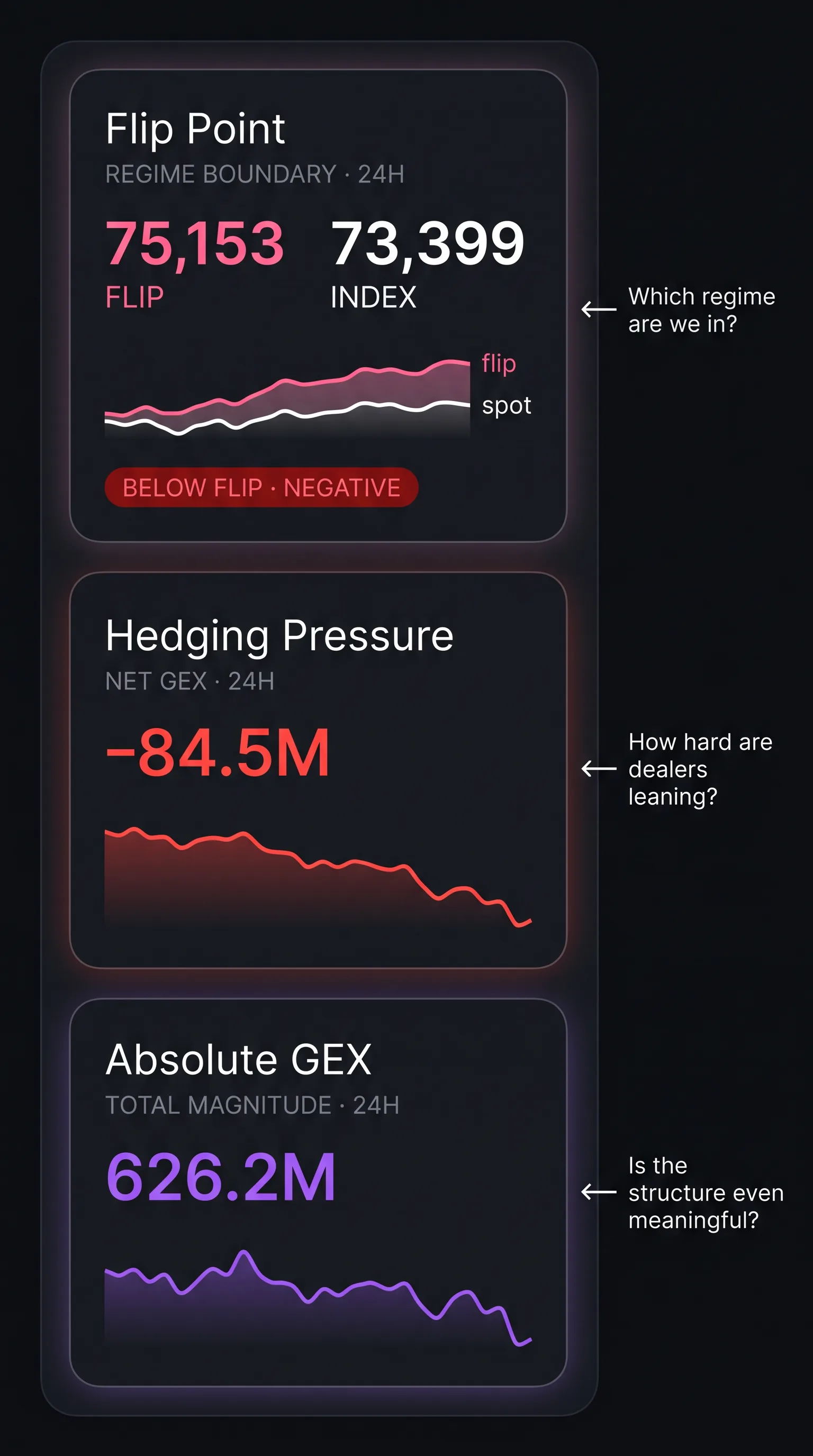 Three cards, two questions: which regime, and how much does it actually matter.
-
Flip Point — the regime boundary expressed as a price. The pink line is the flip, the white line is spot. When spot trades below flip, aggregate net GEX is negative — dealers as a group amplify moves in both directions. When spot trades above flip, net GEX is positive — dealers mean-revert. The card tells you which side of the line you're on and how the gap has drifted over the last 24h.
-
Hedging Pressure (Net GEX) — the same regime question expressed as a number. Some positions push dealers toward stabilizing, others toward amplifying — Net GEX is what's left after the two sides cancel. A negative number means amplifying-side positions outweigh stabilizing ones; positive means the opposite. Flip Point and Hedging Pressure are two angles on the same thing and usually agree — when they don't, the regime is fragile and the flip is about to move.
-
Absolute GEX — a different question entirely: liquidity. Where Net GEX cancels opposing bets, |GEX| sums their magnitudes — the total hedging mass that has to change hands for every 1% the underlying moves, regardless of sign. High |GEX| means dealers sit on a lot of inventory and any move triggers real flow — walls hold, flip points bite. Low |GEX| means the structure is thin: the regime signal above is technically valid but doesn't have much weight behind it. The interesting case is high |GEX| with near-zero Net — the market is loaded with hedging activity but the opposing bets cancel, leaving no directional bias.
The trio works best together. When all three line up — spot below flip, net GEX deeply negative and falling, |GEX| high and rising — dealer hedging is a load-bearing market force and you should expect amplification. When |GEX| is low, the other two cards are mostly decoration.
The gear button
Less visible, equally important: we moved the secondary controls — timezone, theme, exchange filters that you rarely touch mid-session — into a single panel behind the gear icon at the top-right. The toolbar stays focused on what you actually use. Click the gear when you need to change something structural.
Why this matters
Trading GEX is a habit, and habits are sensitive to interface friction. When the question you're asking maps cleanly onto the button you click, you ask better questions. When the dashboard is busy with controls you don't need right now, you stop asking.
The categories are stable: Now, Expiry, History, Forecast. The rail is always there. The clutter is one click away. Try a few rotations through the categories on a live session and the muscle memory builds fast — the dashboard starts answering before you finish the question.
Learn more:
- What is Gamma Exposure? — the underlying concept
- GEX Heatmap: Visualizing Gamma Over Time — deep dive on the History category
- Monte Carlo Simulator — deep dive on the Forecast category
- Max Pain vs Flip Point — what the Flip card is really measuring
Ready to see GEX in action?
Try GammaFlip.io and experience professional-grade gamma exposure analysis
Open Dashboard