Flip Point on the Heatmap: Reading Sticky vs Jumpy Behind the Colors
We just shipped the Flip Point overlay (F) on the GEX Heatmap. Here's why colors alone weren't enough — and the ETH chart from May 11–18 that made the case.
A trader pings us:
"I'm looking at the BTC heatmap. There's a clean green wall above price for the last four days. I'm fading the rally. Why did it just blow through?"
Because there's a layer the colors don't show you: the regime. The wall was real. The reason it broke is that BTC was sitting below the Flip Point — and below F, walls hold less often than they break. Until today, the only way to see that on the heatmap was to switch back to the snapshot, eyeball the F marker, then switch back and translate it in your head.
Now F is drawn directly on the heatmap as a magenta line that tracks through time. Same chart, two layers: colors for structure, F for regime.
This post walks through what changes — using the ETH chart from May 11–18 as a worked example, because that week made the point in five separate ways in seven days.
What the Heatmap Already Showed
The GEX Heatmap plots signed gamma exposure per strike across time. Green = positive gamma (stabilizing zones, where dealers buy dips and sell rallies). Red = negative gamma (amplifying zones, where dealer hedging extends moves rather than dampening them). Brightness scales with magnitude.
That's the structure layer. It tells you where the walls and acceleration zones sit, and how durable they are. A green band that holds its color for four days is a durable wall. A red zone that brightens over 48 hours is an emerging acceleration zone.
What the structure layer cannot tell you — and what colors alone never could — is the regime: whether the next test of any level is more likely to reverse or accelerate.
That's what F is for.
Sticky vs Jumpy: What F Changes
The Flip Point (F) is the strike where total dealer gamma crosses from positive to negative. Spot relative to F sets the regime, and the regime tells you how levels will behave.
Two regimes, two playbooks:
- Spot above F → Sticky regime. Dealers are net long gamma. Their hedging dampens moves: they sell rallies, buy dips. Levels work as reversal points. Walls hold. Mean-reversion edges are favored. (Sometimes called the "magnet" regime.)
- Spot below F → Jumpy regime. Dealers are net short gamma. Their hedging amplifies moves: they sell into drops, buy into rallies. Levels work as acceleration zones more often than reversal points. Momentum extends. Tactical fades fail more often than they work.
The full mechanic lives in our Flip-line lesson and the Snapshot vs Forecast post. The one-line version: when spot < F, every dip into negative gamma forces dealers to sell more, not less. That's the "jumpy" part.
Until now, you saw the F number on the snapshot chart. The heatmap showed colors but no F. To read regime from the heatmap, you had to leave it. Now F sits right on top of the colors as a continuous line — and the relationship between price and F across the entire window is visible at a glance.
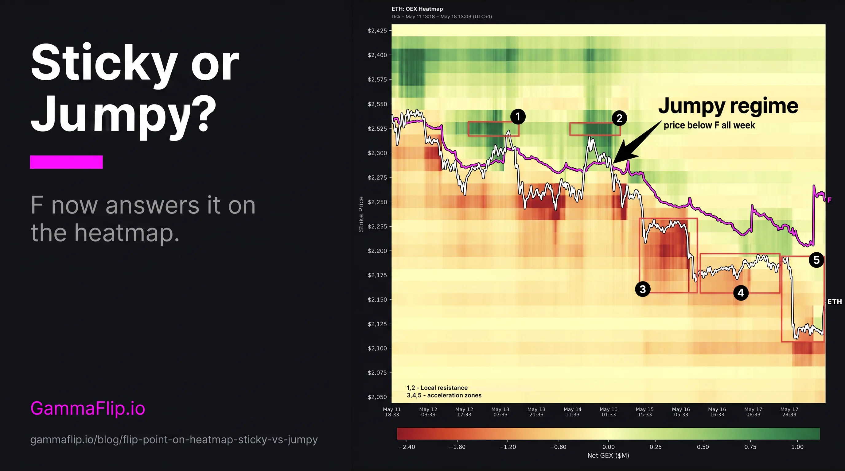
Here's what that looks like in a week where price stayed below F the entire time.
ETH May 11–18: Jumpy All Week
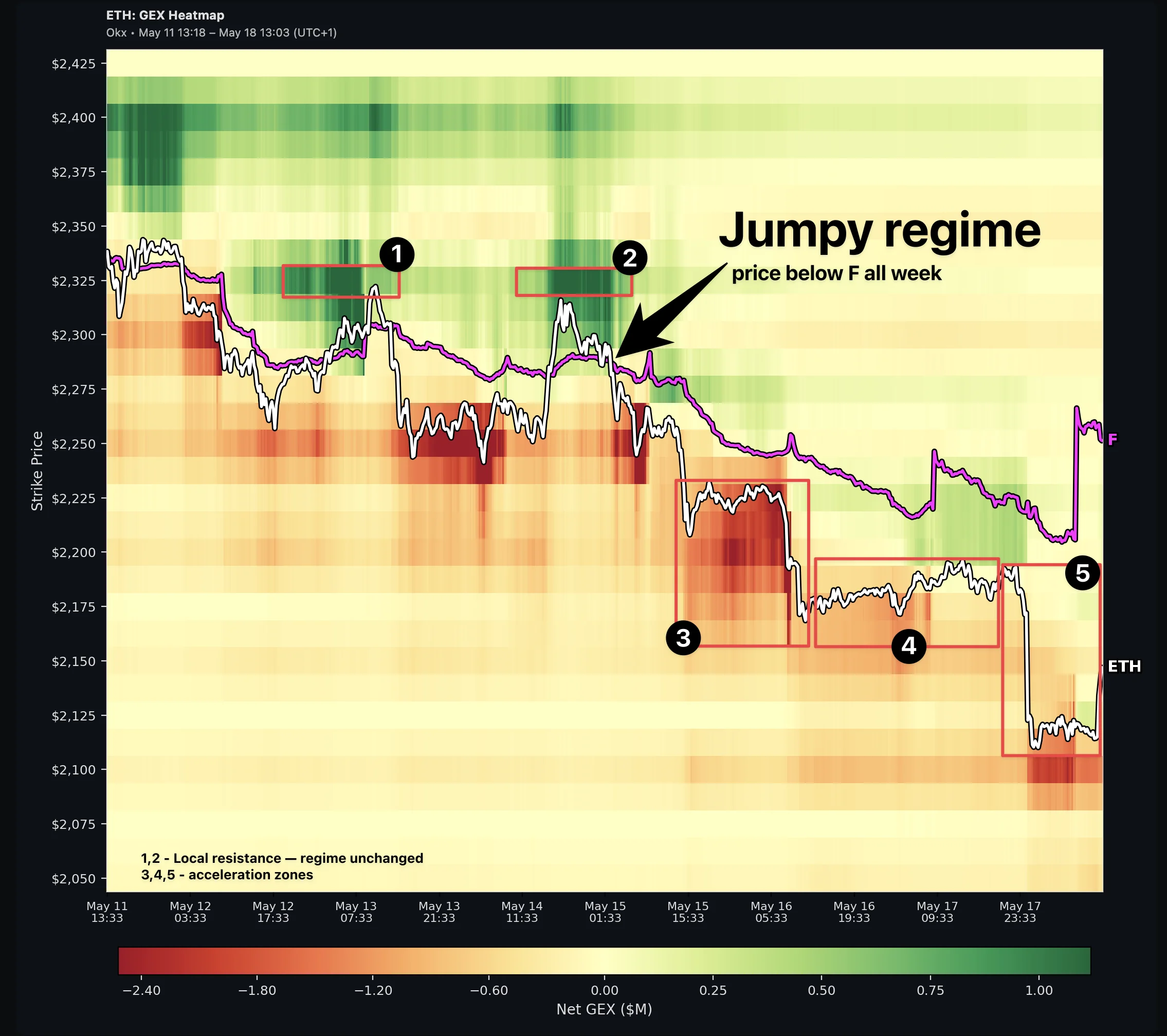 ETH lost 10% in seven days. The structure was visible on the heatmap. The regime — Jumpy the entire time — explained why the structure broke instead of holding.
ETH lost 10% over seven days, sliding from $2,340 to $2,115. On a candle chart the path looks chaotic — three short squeezes, a few false bottoms, a cascade. On the heatmap with F drawn, the regime call was trivial:
- F sat at $2,330 on May 11 and slid down to $2,265 by May 18.
- ETH traded under F every single bar.
- Seven days of Jumpy regime. Levels below price more likely to accelerate than hold.
The cascade wasn't a prediction the heatmap made. It was the base rate of what Jumpy regimes do when spot keeps drifting lower.
What follows is the week broken into two patterns — both of which need F to interpret correctly.
Pattern 1: Two Clean Rejections at Green (①②) — Regime Unchanged
Twice during the week, ETH rallied into small green pockets sitting right next to F, and both times the green braked the move:
- ① May 12–13: rally into the green pocket topped at ~$2,310, right at F. Price slid back to $2,250 within hours.
- ② May 14–15: same setup. Top at ~$2,320. Slid to ~$2,235.
These pockets did exactly what positive gamma above price is supposed to do — brake the rally. Both rallies reversed cleanly off the green. The fade trade was the right call both times.
But here's where readers get tripped up: a level holding is not the same as a regime flipping.
These pockets are what we'd call regime-transition zones — small positive-gamma areas right next to F, where any test of the pocket is also a test of F itself. They can reject a rally without changing the regime around them. The regime only flips when ETH closes above F. Neither rally did. So the structural read stayed Jumpy, and the next move down was always the higher-probability one.
The mistake would have been reading either rejection as "the wall held, structure is bullish now." It wasn't. Tactical resistance works in any regime. Regime change needs F broken.
This distinction is what the F overlay buys you. Without F drawn, you'd see a rally rejected at a visible green pocket and call it a structural top. With F drawn, you see the rally rejected at F — and you know that until ETH closes above F, every subsequent rally is a sell.
Pattern 2: Red Zones Below as Accelerators (③④⑤)
Below price sat a stack of pre-existing red zones. In a Jumpy regime, the base rate is acceleration through, not bounce off:
- ③ $2,225 (May 15–16) — held for ~24 hours, then broke. Price slid to $2,180.
- ④ $2,180 (May 16–17) — failed as support, slide-through to ~$2,160.
- ⑤ $2,115 (May 17) — final cascade. ETH settled there.
Note ③ — it held for a full day before cracking. Jumpy regime says "more likely to accelerate," not "instantly accelerates." The structure still gets tested. Some tests hold for a while. Eventually the regime wins.
This is the opposite mirror of Pattern 1. In Pattern 1, green did its job (resistance) but the regime constrained what that meant (tactical, not structural). In Pattern 2, the red zones did the opposite of what their color might suggest to a regime-blind reader: instead of acting as support, they served as the steps of a staircase down.
A trader reading the heatmap without F could easily look at ③, see a clear red zone below price, and think "support level — long here for the bounce." A trader reading with F sees ETH well below F, recognizes the Jumpy regime, and treats ③ as a likely acceleration zone — short into the break, not long for the bounce.
Same chart cells. Opposite trades. Determined by F.
How to Read Green and Red Without Overfitting
The framework is probabilistic, not mechanical. Same colors can behave differently depending on regime:
| Zone | Sticky regime (spot > F) | Jumpy regime (spot < F) |
|---|---|---|
| Green wall above price | Reversal — fade into it | Tactical resistance only; trust F more than the wall |
| Green pocket near F | Confirms sticky structure | Brakes the rally (real resistance) — but regime unchanged |
| Red zone below price | Mean-reversion support | Likely acceleration zone, occasional 1-day hold |
| Red zone above price | Volatility on the way back to F | Direction back toward F (rallies feed through, not into it) |
On this ETH chart, every cell above behaved as the Jumpy column predicted. That doesn't mean it always will — it means the base rate is your edge, not the prophecy. Some weeks the structure beats the regime call locally. Over enough trades, regime wins.
This table is the most compact answer to "how do I read the new overlay." Print it. Tape it to the monitor. After a week of using it, you won't need it.
Where We Ended
ETH closed the week at $2,135. F sat at $2,265. That's a $130 gap, about 6%. Still Jumpy.
A new green pocket formed at $2,225–$2,275 just below F (visible bottom-right of the heatmap). That's another regime-transition zone — if ETH reclaims F, it becomes the first support. Until then, it's another ceiling.
The regime change signal to watch for: a clean close above F with follow-through. That's when the playbook flips from "don't fight the staircase" to "fade rallies into walls." Until that close happens, the structure-only read of the heatmap will keep generating bad trades — fade-the-red-zone longs that get steamrolled.
This is also the moment where the heatmap with F earns its keep over the heatmap without. A trader watching only colors might see the new green pocket and call a bottom. A trader watching colors + F sees the same pocket as a ceiling-in-waiting — useful when price gets back up to F, dangerous before that.
Adding This to Your Routine
If you already have a heatmap routine (the original heatmap post and perp-trader Lesson 7 cover the basics), F adds one extra glance:
- Open the heatmap. F is on by default; if it's off, click the FLIP toggle in the toolbar.
- First look — where is the white price line relative to the magenta F line? Above = Sticky. Below = Jumpy. Right on it = transition zone, the most uncertain state.
- Second look — what's the trajectory of F itself? Sliding down with price (like the ETH chart above) = bearish structural drift. Sliding up = positive structural drift. Flat with price moving around it = chop.
- Third look — interpret the colors through the regime lens. Use the table above. Green above price in Jumpy ≠ structural ceiling. Red below price in Sticky ≠ a cliff.
Three glances, maybe ten seconds added to whatever you were doing. The payoff is not getting trapped in the green-wall-but-spot-below-F or red-zone-but-spot-above-F traps — both of which fool a structure-only reader the way they fooled the trader in the email at the top of this post.
The Mantra
The snapshot tells you where. The heatmap tells you when. F tells you how the levels will behave.
Watch F first. Then read the colors in regime context. Green near F in a Jumpy regime isn't bullish — it's just local resistance. Red below price in a Sticky regime isn't a cliff — it's a magnet. Same chart, two readings, depending on which side of F price is on.
The Flip Point overlay is live on the GEX Heatmap now: open the app, select Heatmap, look for the magenta line. The FLIP toggle lets you turn it off when you want the original view.
Related reading:
- GEX Heatmap: Visualizing Gamma Over Time — the original overview of the heatmap chart
- Snapshot vs Forecast: GEX Flip Points — how F is computed and why it moves
- Max Pain vs Flip Point: Gamma-Aware Equilibrium — when F and MP disagree
- Perp Trader Lesson 2: The Flip Point — sticky vs jumpy explained from first principles
- Perp Trader Lesson 7: Reading the Heatmap — durable bands, color flips, and structural shifts
Ready to see GEX in action?
Try GammaFlip.io and experience professional-grade gamma exposure analysis
Open Dashboard